Relationships are a natural occurrence and have develped everywhere since the beginning of time, often seen between human beings, however relationships cannot purely be based on superficial attraction. Artists have used this knowledge to create pieces of work containing nature, objects, people and colours which compliment each other to emphasise the importance and reality regarding the interaction between two or more elements.
Symmetry - Daniel Mercadante
The video below named 'Symmetry' displays everyday things with their opposing part. Some images show objects which are constantly seen together (salt & pepper) whereas other present those with highly contrasting scenarios for example cops and robbers, fire and ice, cat and mouse, coca cola and pepsi. I find it interesting how the creator is able to produce such effortless understandable pictures because we are so used to contradictory or complimenting conditions in the 21st Century. Therefore in the future within this unit I will attempt to apply these techniques whether that may be using artificial or organic lighting to easily convey relationships.
|
|
|
Altering the Context
|
Upon creating an image you must take into consideration the thoughts and feelings of the spectator, possibly with the context of the photo or the objects within it. This may be very important considering it can persuade the way in which the viewer understands the photo. For example, artists who explored the aspects of how simply modifying a picture can change the way it is perceived were Guy Catling, a graphic designer and Hayley Warnham. Both had similar techniques of editing an image by layering on top patterns (in Catling's case) or plain colours (Warnham).
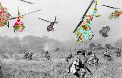
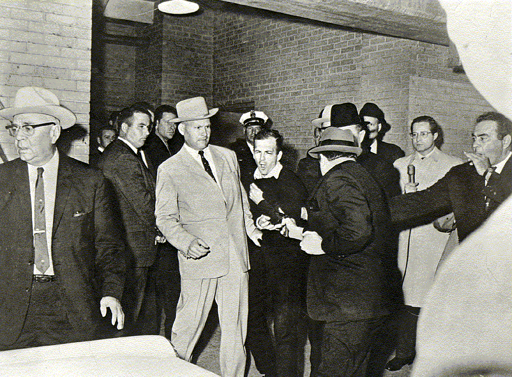
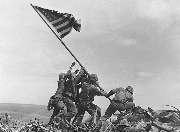
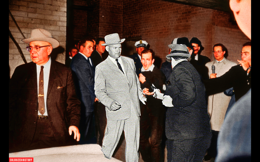
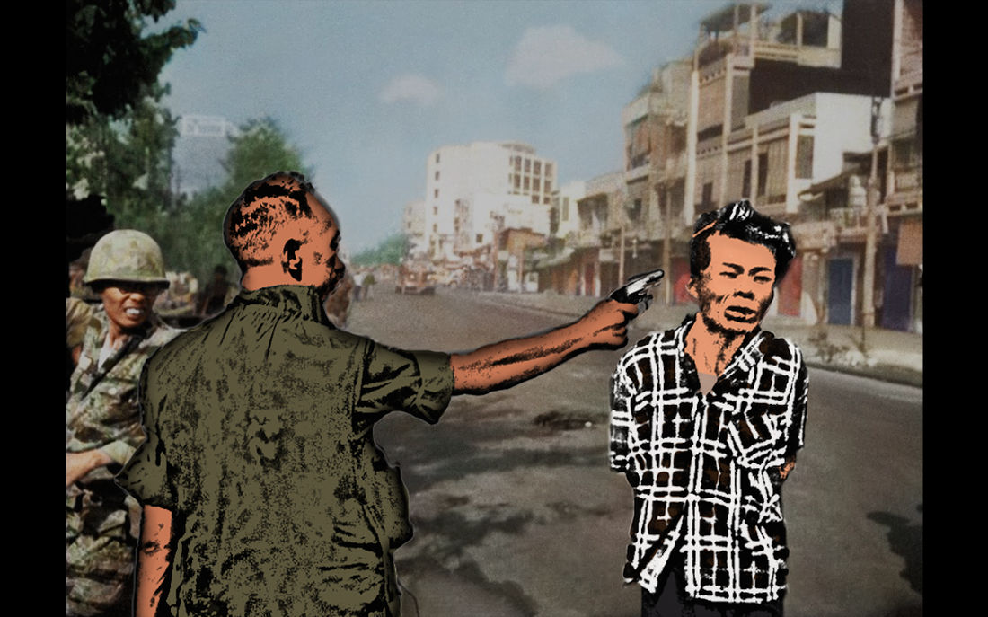
Catling often uses iconic images to alter in his style. The one shown on the right depicts the notorious helicopter movement in the Vietnam war and when looking at the original a sense of fear is struck into the viewer however post edit using floral patterns some of the brutality is forgotten, overall making the context less harsh. Therefore it shows to what degree the relationship in an image can transform depending on what is changed, in this case helicopters often associated with the thoughts of dangerous and terror is made into a more comical approach. |
Guy Catling
Hayley Warnham
|
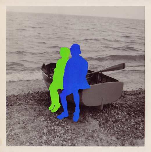
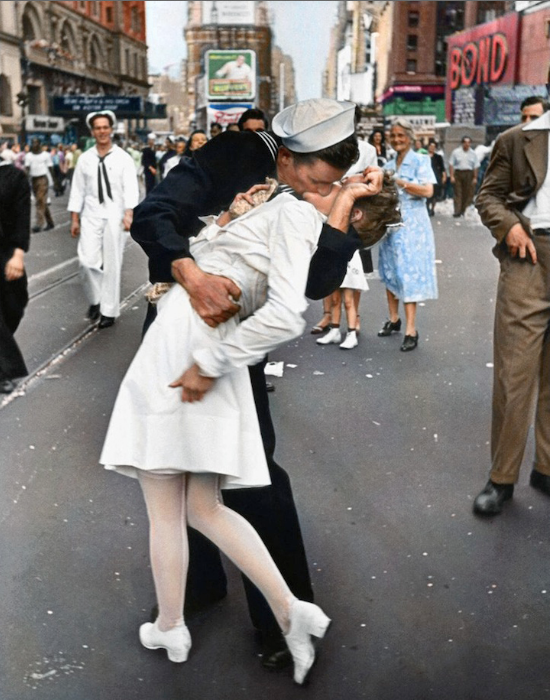
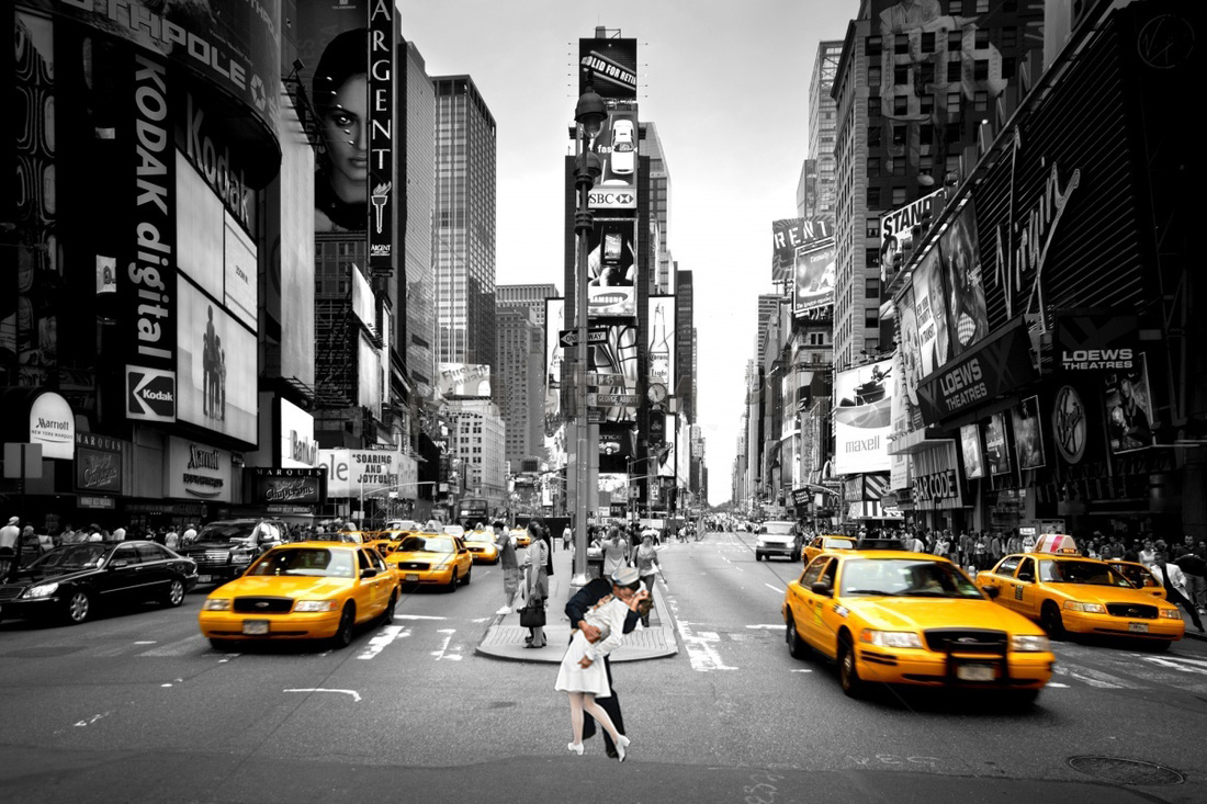
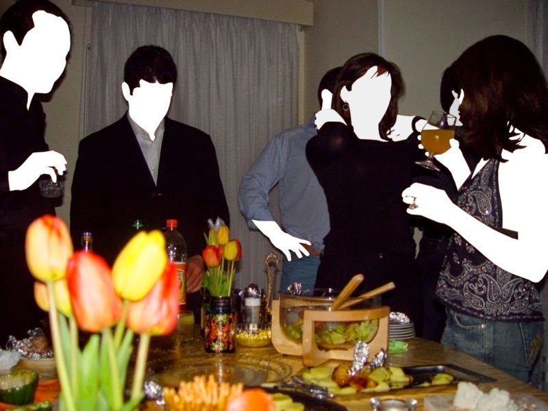
Hayley Warnham focuses on the more critical components of images such as the living things or main attractions. By removing and replacing them with solid filled shapes it constructs an impression of mystery and the ability to place yourself in the image in space of the silhouette. Furthermore, the border and finish of the picture gives an ageing effect as if these photos were in an album. This creates a nostalgic reaction that I enjoy because again the relationship is accentuated however not between the expected objects.
Our first task was to take a set of iconic images and alter them in the style of wither artist then publish our outcomes.
Our first task was to take a set of iconic images and alter them in the style of wither artist then publish our outcomes.
|
|
Edit Walkthrough
Step 1: Select the part of the image intended for editing and create a new document with this selection using the copy and paste tool.
Step 2: Create a new copy of the background using Cmd/J, desaturate the image using Cmd/shift/U, copy the layer again, then invert the colours using Cmd/I. After that has all been done, change the blend mode to colour dodge and use the gaussian blur with a radius set to 8px.
Step 3: Change the blend mode to multiply and duplicate the image using Cmd/J three times. Then use a layer mask with the paint brush set to black to rudy up the image (surrounding areas and skin etc...)
Step 4: To colour the cartoon image you must select a colour from the original image. Once complete using a brush tool carefully paint over chosen areas to finalise the look.
Step 5: Lastly, select the which parts of the image you want using the magic wand tool then copy and paste it into the original photo over the unedited part to finish off. Also the opacity can be altered on either layer to add extra depth or give the appearance more or less context.
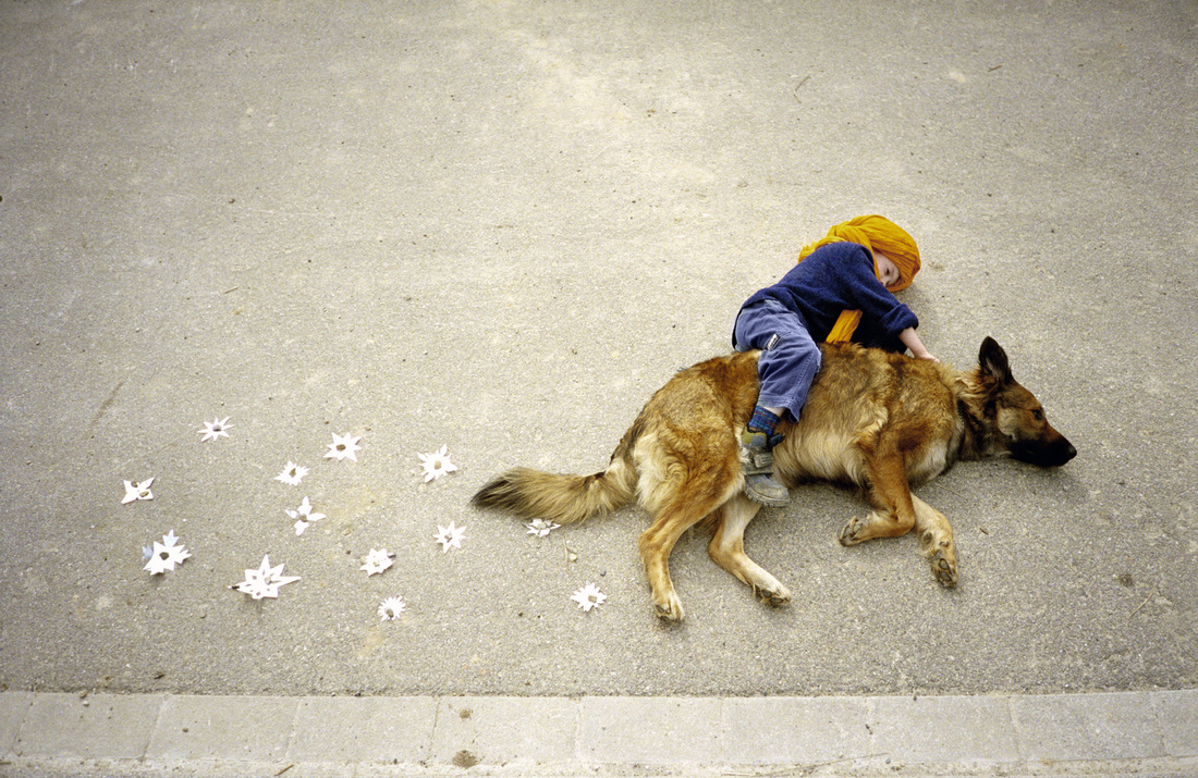
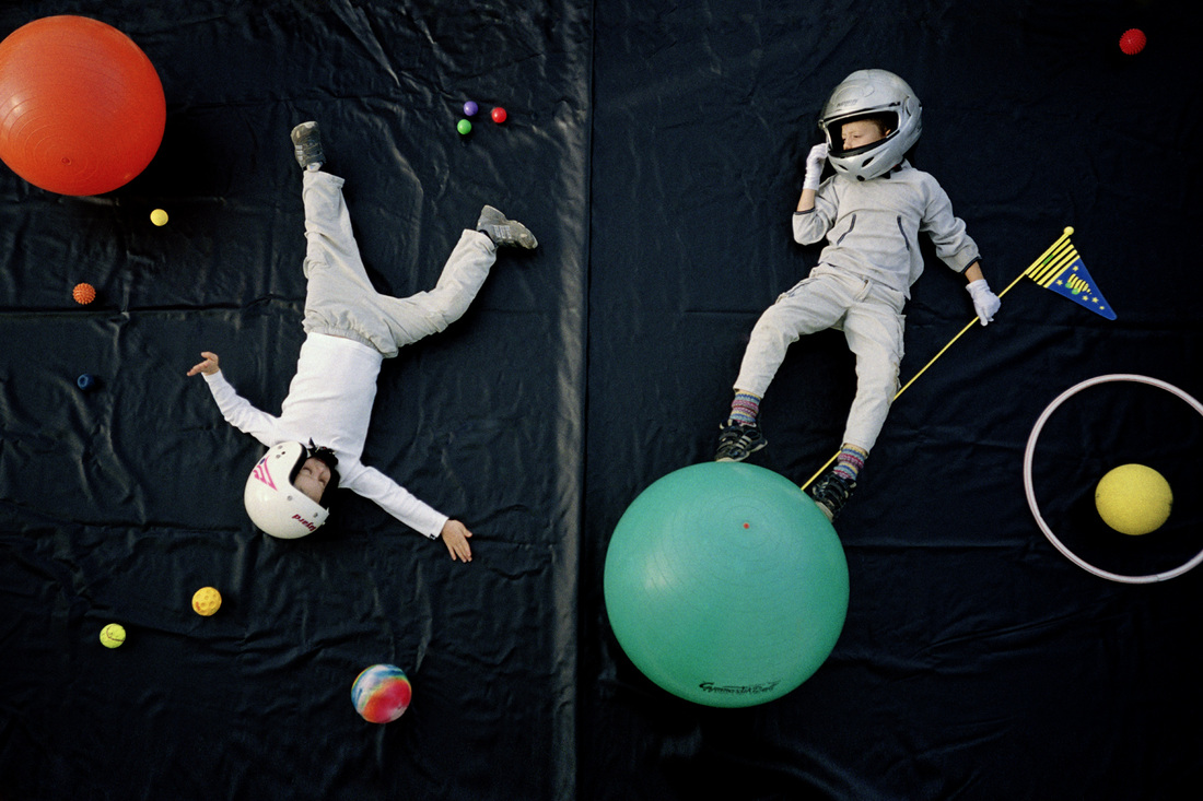
Jan Von Holleben
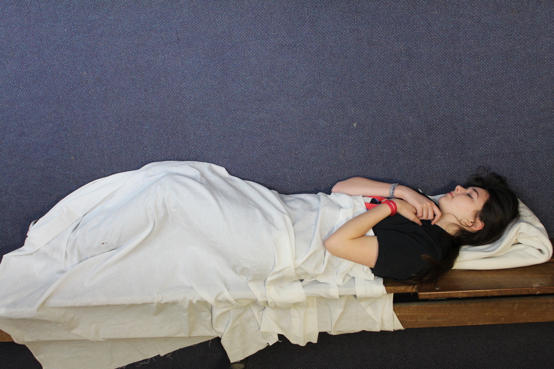
Jan Von Holleben was born in 1997 and grew up in Cologne, Germany. His photographic works are heavily influenced by his parents (cinematographer and child therapist) as well as his past. As a result, a few of Holleben's collections involve common childhood dreams such as flying, exploring or filling the shoes of their favourite characters however it is shown from a bird's eye view alongside items placed on it's side to allow for more freedom to move around and create the effect originally intened for the child in the final image. I appreciate his work in the fashion by which using the technique of lying down on any surface can be used as a canvas to create art. For example using dull, grey concrete to represent a desert, dark coloured bed sheets to serve as outer space or the depths of the ocean and grass simply as a wonderland. Furthermore, the simplicity in using everyday objects to represent something either completely different but similar in shape or use it for it's primary use. In the future I will try to recycle Holleben's idea to revive boyhood memories and imaginations.
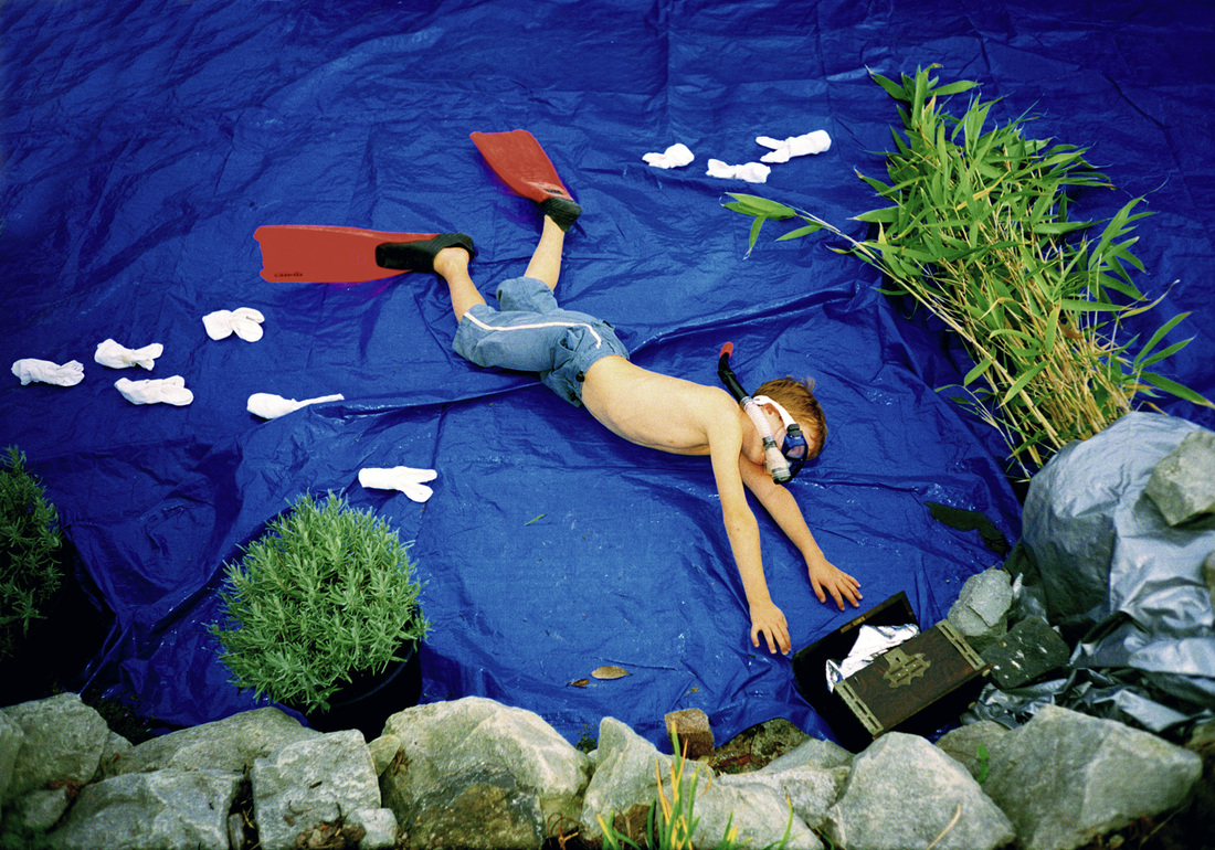
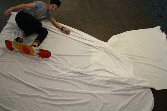
Our Response to Holleben
In response to Holleben's work, using ladders, white rugs and a broken skateboard we created a stop motion piece trying to replicate a snowboarder rushing down the face of a slope. This came with a few difficulties including trying to make the transition from top to bottom as smooth as possible but I felt we achieved this by only inching forward slightly each time. Furthermore, looking at the final outcome it mirrors the likes of the works above achieving the ideology behind the artist as the audience are persuaded to reminisce over their own childhood memories and realise the importance of how it influenced the present and future to come. Finally, the piece on the right also photographed from above displays a scene from snow white before her 'prince charming' arrives to awake her. We set up this backdrop because it is a classic scene for most young girls to dream about living the reality of becoming a fairy or a princess.
|
|
Memory
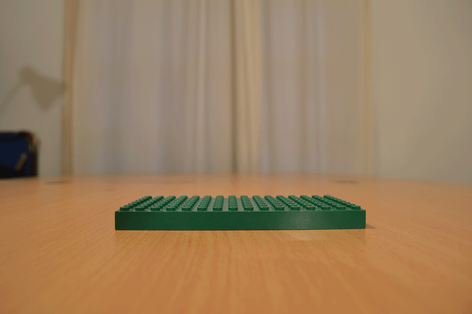
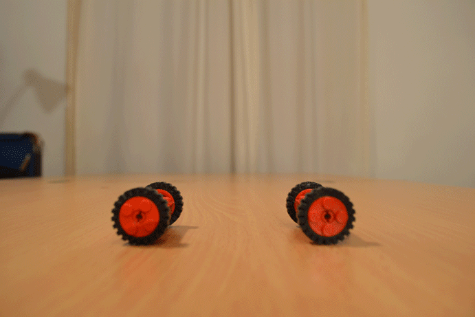
Pursuing the segment on childhood memories, the creation below shows my interpretations of a combination of two photographers Jan Von Holleben and David Levinthal. I selected these two photographers as inspiration because one could appreciate the living aspects of the piece once it is brought to life via movement hence why the pieces are GIFs. In addition, being able to witness the object within the image to the fullest allows for freedom and no restrictions which perfectly reflects the classic childhood toy Lego. Lego ignites imagination by being able to build anything in mind from a small multi-coloured house to a fully functional robot with the only limitation being the number of bricks. I feel it easily helps convey the message between childhood memories and present life as it brings back a connection between oneself and their own childhood toys in the best and easiest part of their life (so far maybe).
|
|
These images were taken in a stop motion fashion and then stitched together in photoshop to create what you see above. The idea came from Ed Sheeran's music video 'Lego House' where he sings about relationships falling apart as well as being built back together whilst Lego is smashed on the floor rebuilt into something completely different in the background which falls neatly into the the task; using toys to reunite ourselves with our past and build up our character. During the making of this piece I explored through dusty boxes untouched for years showing that even though we may have grown out of childish habits, we are still attached to what made us today and find it hard to let go. In the future for a possible development, I would abandon the stop motion aspect of this but instead adopt the style of Paul Smith who over fabricates images to enhance the childish attitude within the image.
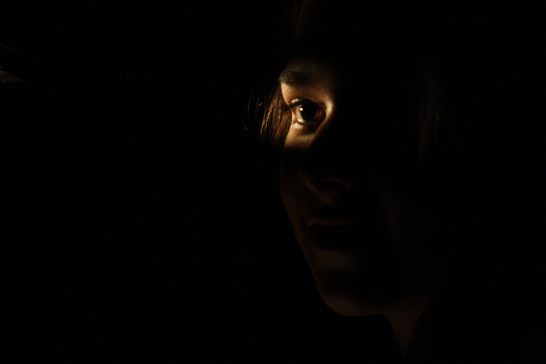
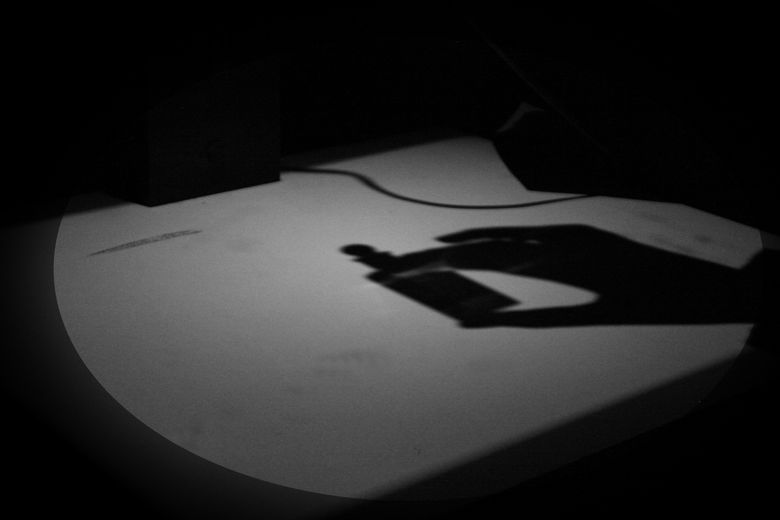
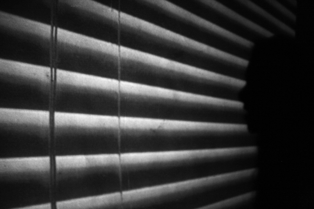
Film Noir
Film noir is a French term meaning "Dark film". The genre bursted onto the scene in the 1940's and extended into the 1950's mainly expressing dark low key lighting. It often portrayed a story relating to the life of crime sometimes including seduction based on events that emerged from the US great depression. Sir Alfred Hitchcock, a famous film director present around this time explored the ways a camera could be moved and adjusted to entice the audience, he was the master of suspense and once said "There is no terror in the bang, only in the anticipation of it". Meaning an audience will be more afraid of not knowing when to expect something rather than not knowing at all, the effect of suspense can be emphasised when using techniques common throughout the film noir era. As a result, in class we have attempted to replicate typical scenes using shadows, a mixture of a strong and weak lighting and other relevant props.
|
|
|
|
Objects
|
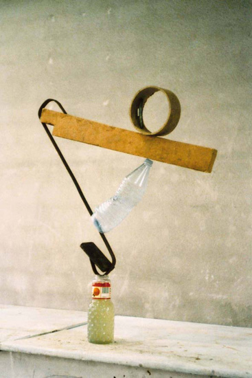
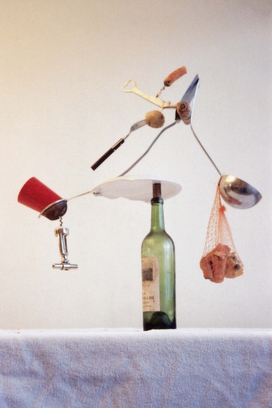
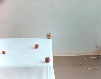
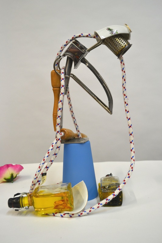
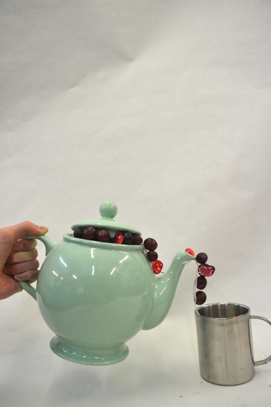
Peter Fischli & David Weiß were an artist duo who had been collaborating since 1979 until the recent death of Weiß. In class we have been studying their most notorious piece of work "The way things go" which consists of everyday household objects not used for their primary purpose but instead were setup in a domino effect with no real objective other than to set other things off. By creating a system such as this with objects used in such a way, we investigate our relationship not only with them but also how one object can have an affect on another. Therefore in class we attempted to create a structure by balancing household objects upon each other which either integrated well or collapsed and broke.
|
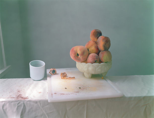
One more artist to look at was Laura Letinsky, a photographer who has developed her practice since the late 1990's through influence of 17th Century Renaissance painting. The work we have been studying and trying to replicate shows the aftermath of a meal containing stained table clothes, spilled wine and misshapen fruit insinuating mortality, failed ambitions and pensiveness. Using a combination of objects and paper cut outs, we produced a number of shots relating to Letinsky's work which shows the relationship between the two are considerably contrasting despite their similarities. Furthermore, the spectators view on the image can change once we notice which part of the piece is genuine and what is not either giving that part more or less attention.
|
|
|
Everyday Objects
Richard Wentworth is another artist to observe when studying the relationships unit. His work focuses on transformation, of subtly altering and juxtaposing everyday objects which, eventually changes the way we look at these objects and the environment they are in.
Richard Wentworth
|
|
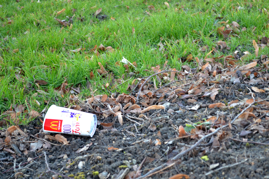
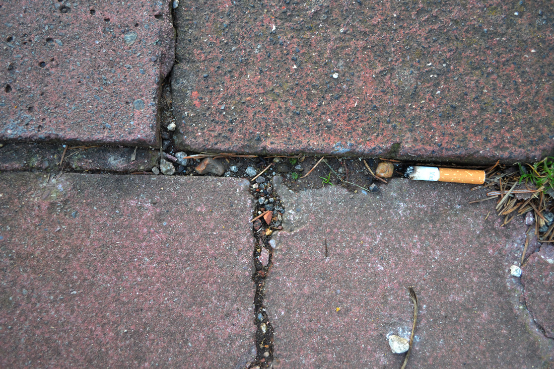
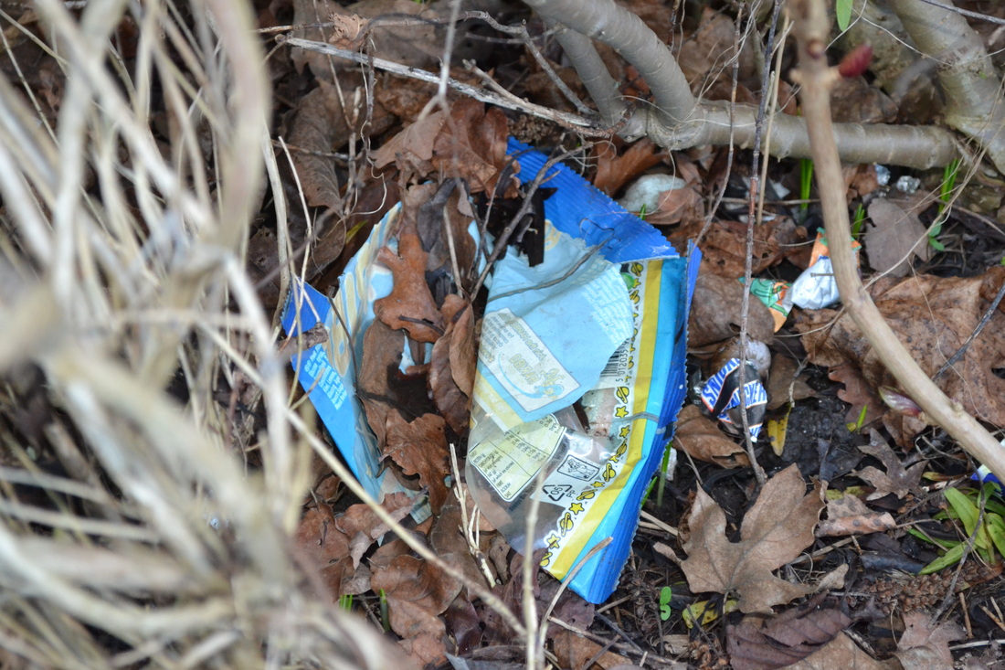
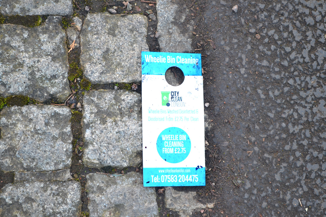
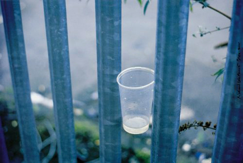
When observing an object in a strange place, it forces the spectator to ask the question how it got there however unfortunately the answer is usually litter. As a result the affect of this is usually sorrow especially as all of my photos above where pictures of litter. On the other hand the relationship can be changed if the way in which the item is photographed. For example if the cup was picture from a low angle and was made to look bigger, then spectators would feel more persuaded to feel more intimidated. I will try to utilise these effects in the future to further enhance the relationship or context of projects.
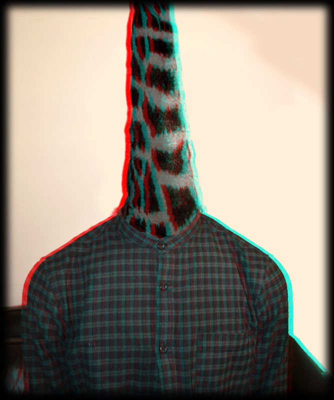
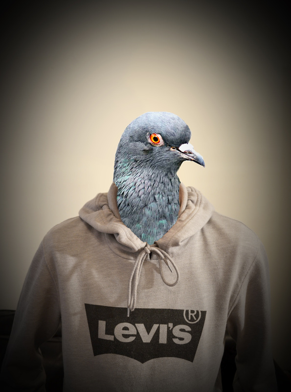
1st Strand - Animal Heads
|
|
|
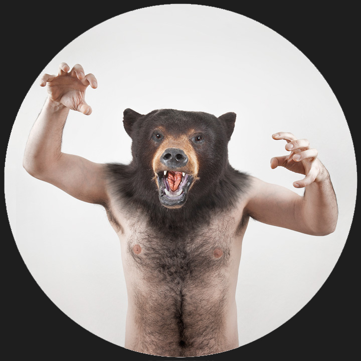
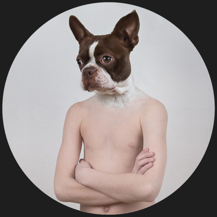
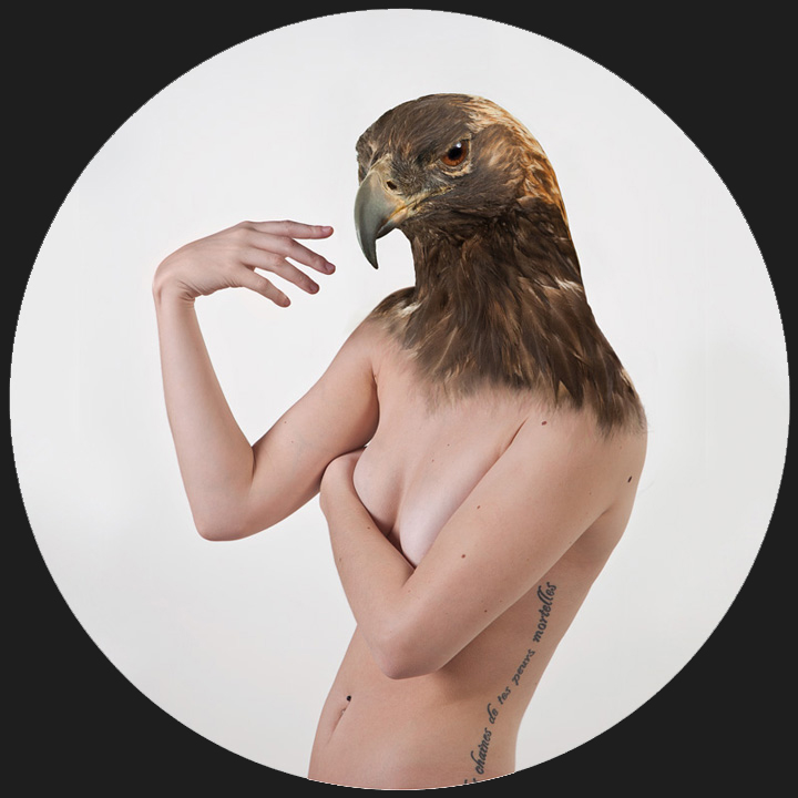
Ulric Collette's Therianthorpes Series
|
|
|
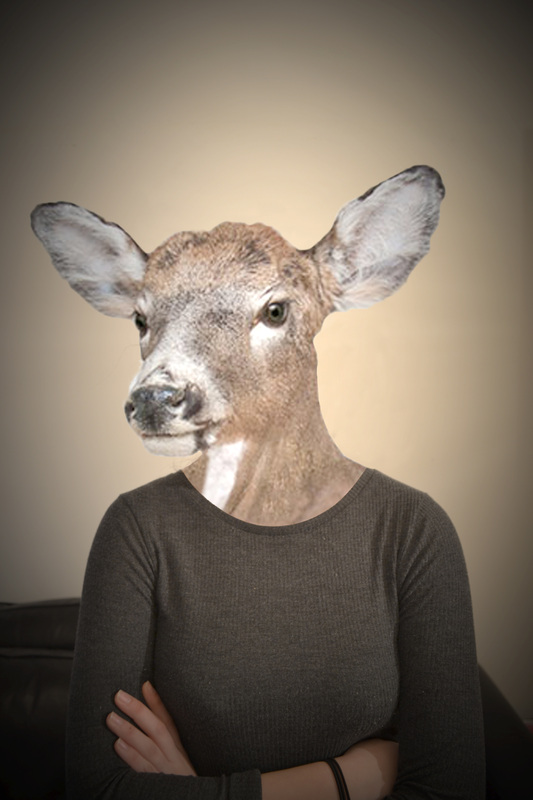
My interpretation of the work above
One of the three stands I decided to pursue involved revisiting the artist Ulric Collette from the portraiture unit. Most famous for his genetic series which see family members of various generations merged together to create a surrealist piece instead this time he has combined the use of humans and wildlife to piece together a mythological looking creature hence the title therianthorpes.Although there is a distinct line between animal and human it is still somewhat believable almost as if they have been captured mid transformation. The most appealing aspect of his work to me is the way the model in the photo has posed to replicate the expression on the animals face. For example, the picture above shows a depressed looking dog which is then further emphasised by the folded arms and slumped shoulders of the human beneath.
As a result I have tried to replicate Collette's work by photographing friends and matching their posture with an animal respectively. For example, in the first image, the model appears impatient and slightly irritated shown by the folded arms, therefore I chose to use a deer which seems to appear tempered hence achieving the same goals as Ulric Collette.
As a result I have tried to replicate Collette's work by photographing friends and matching their posture with an animal respectively. For example, in the first image, the model appears impatient and slightly irritated shown by the folded arms, therefore I chose to use a deer which seems to appear tempered hence achieving the same goals as Ulric Collette.
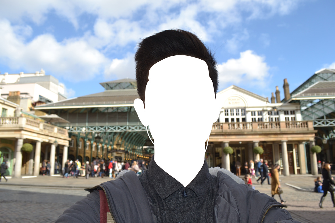
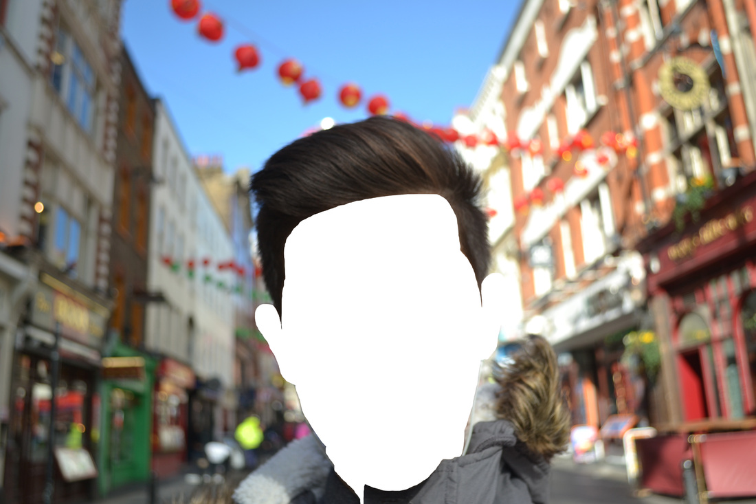
2nd Strand - #Selfie
|
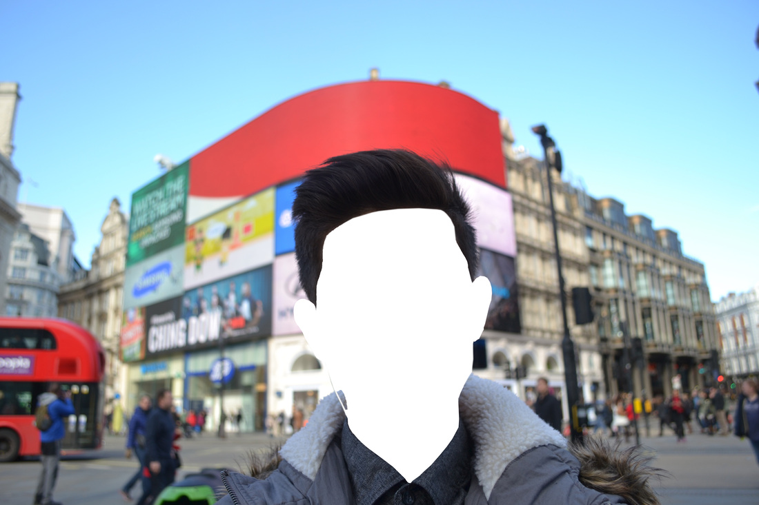
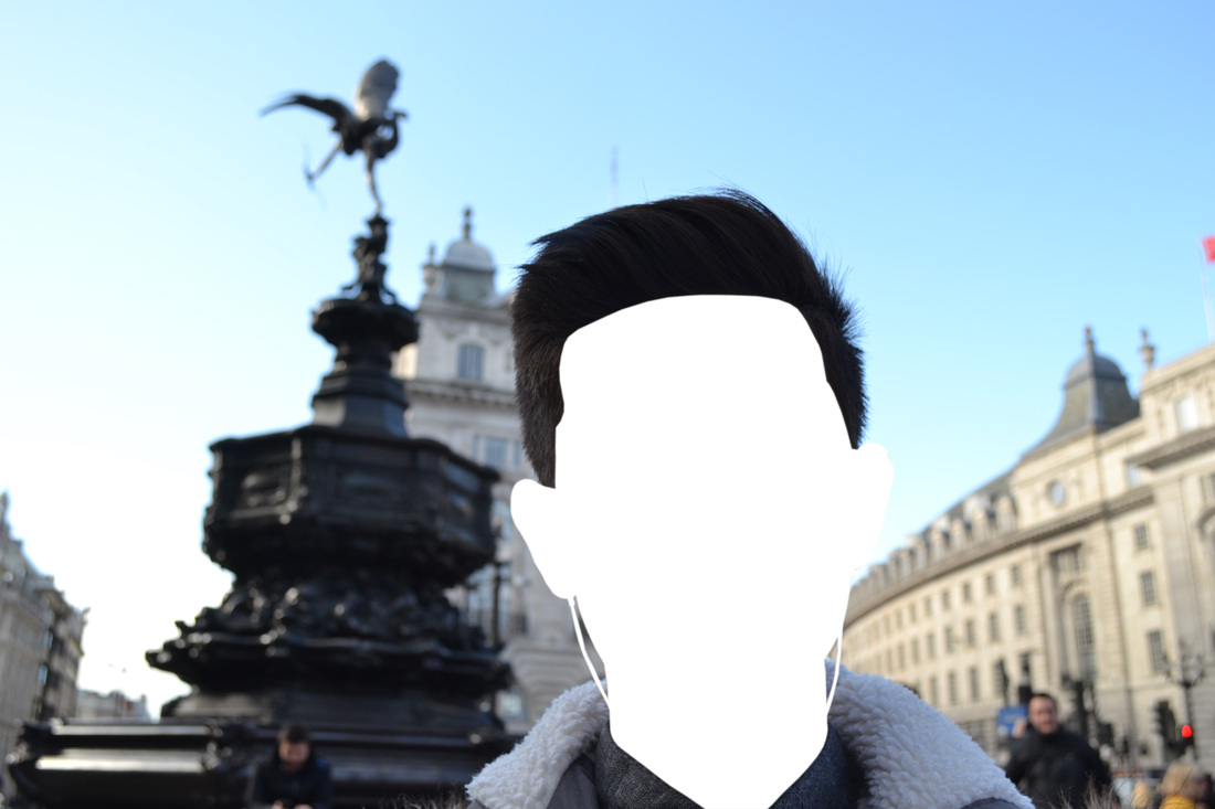
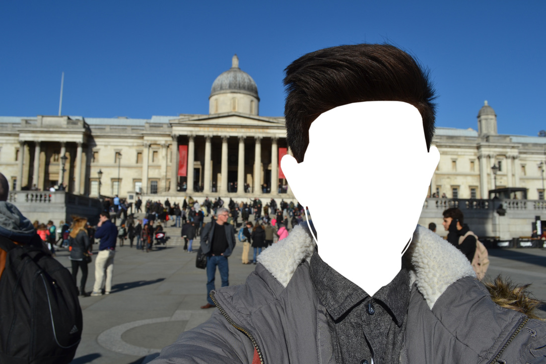
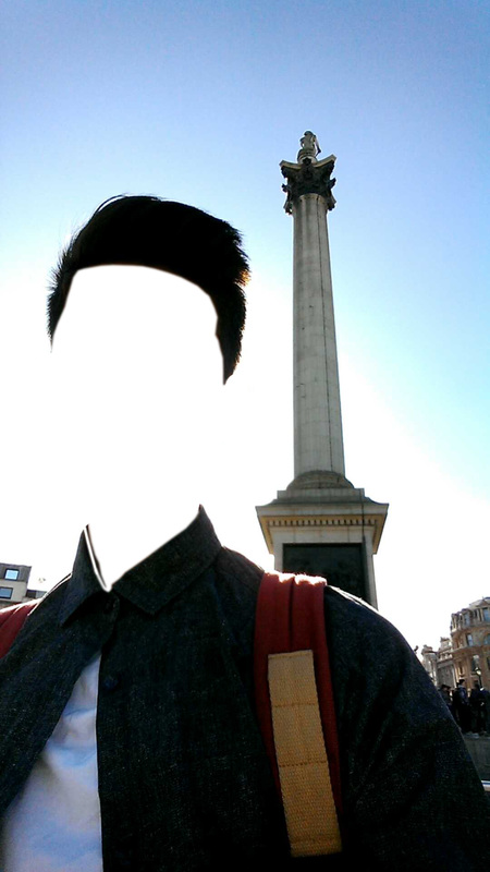
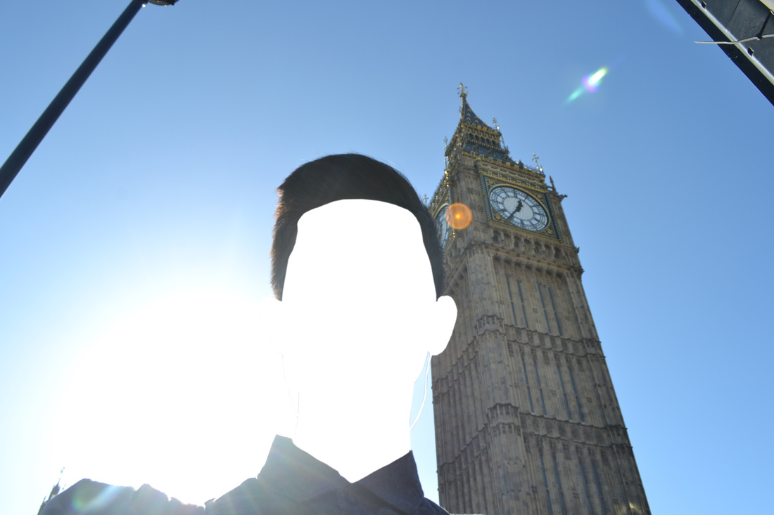
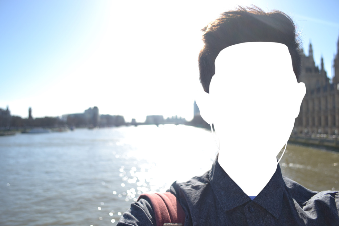
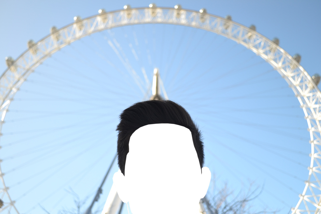
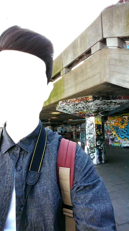
To take a photograph of one's self normally using a smartphone or digital camera is called a 'selfie'. The word was added to the dictionary in 2013 and is used with #'s on social media such as Facebook, Twitter and Instagram over 100,000 times a week. It is mainly used to show a flattering image of the user or to show what someone is up to. But what the mainly young photographers enjoy about the selfie is the amount of control they have over the final outcome as they are able to alter the framing, position of the camera, angle of their head etc... Therefore I asked the question
|
|
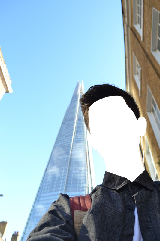
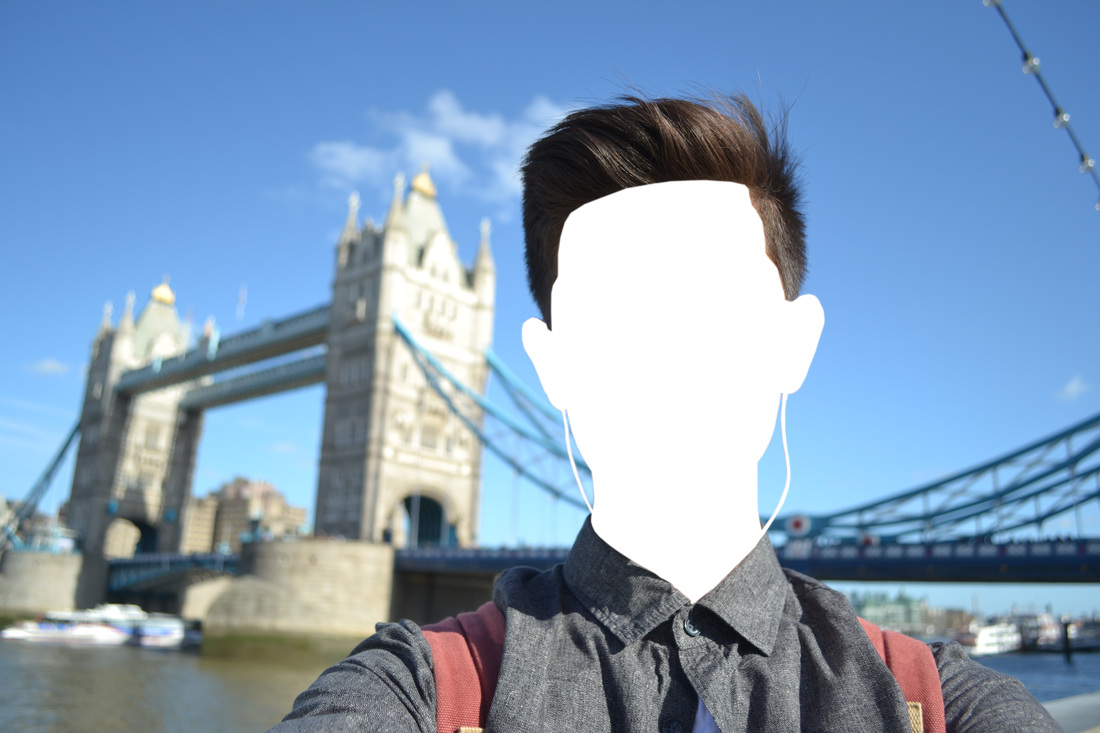
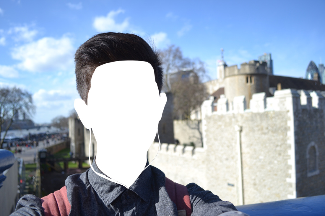
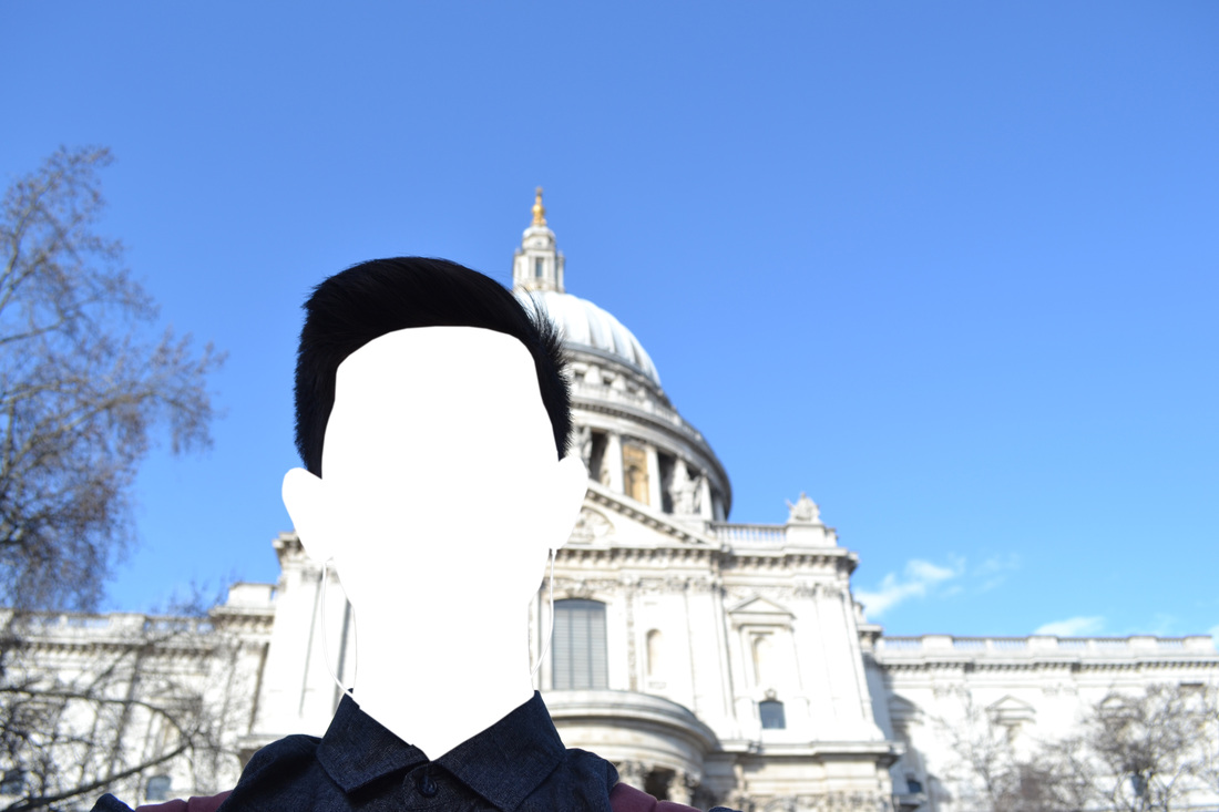
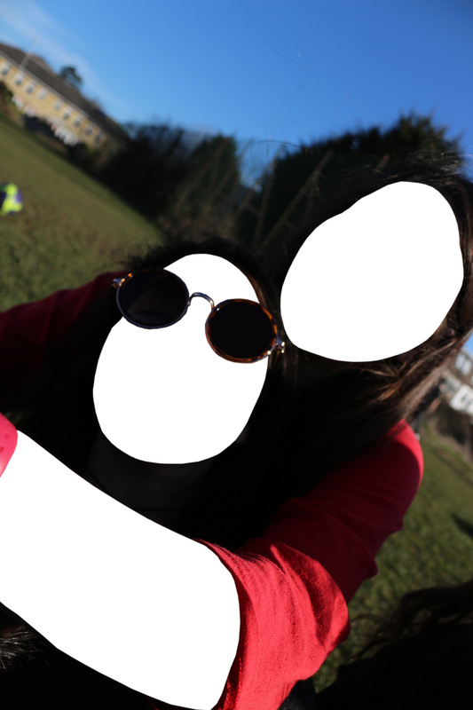
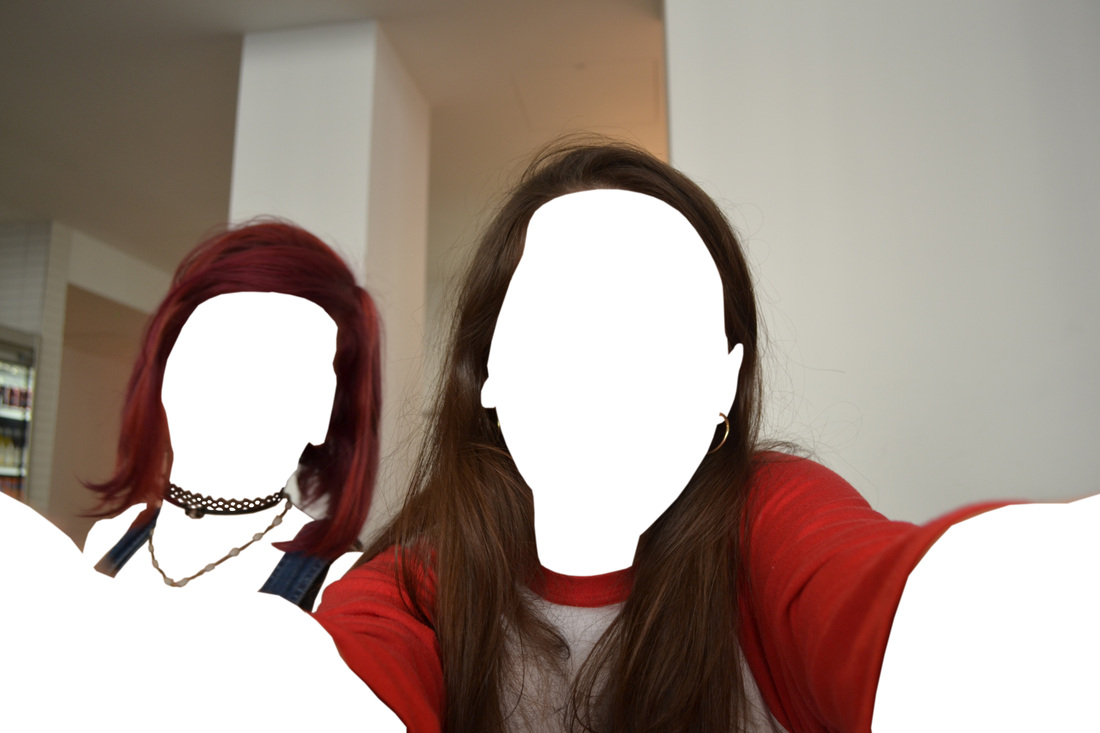
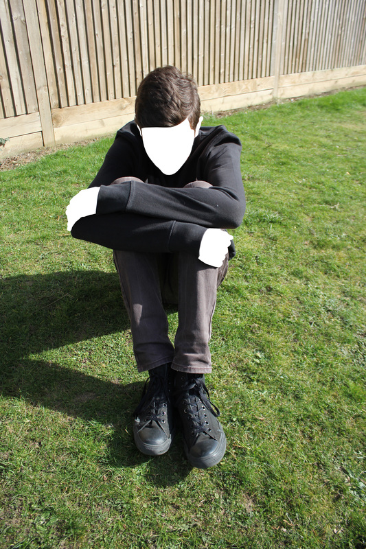
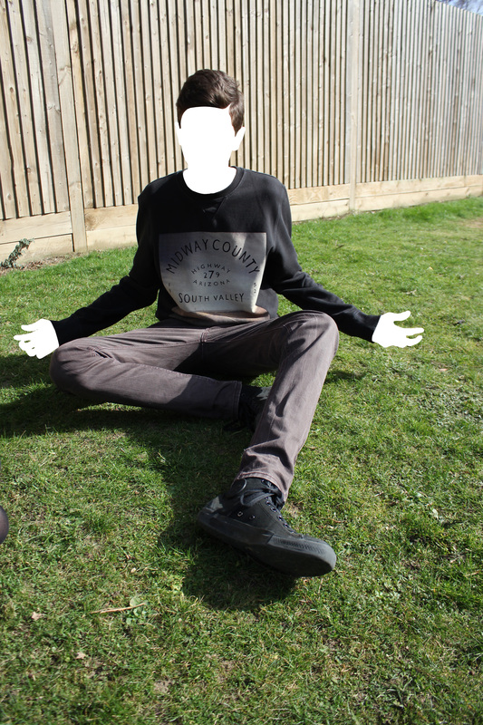
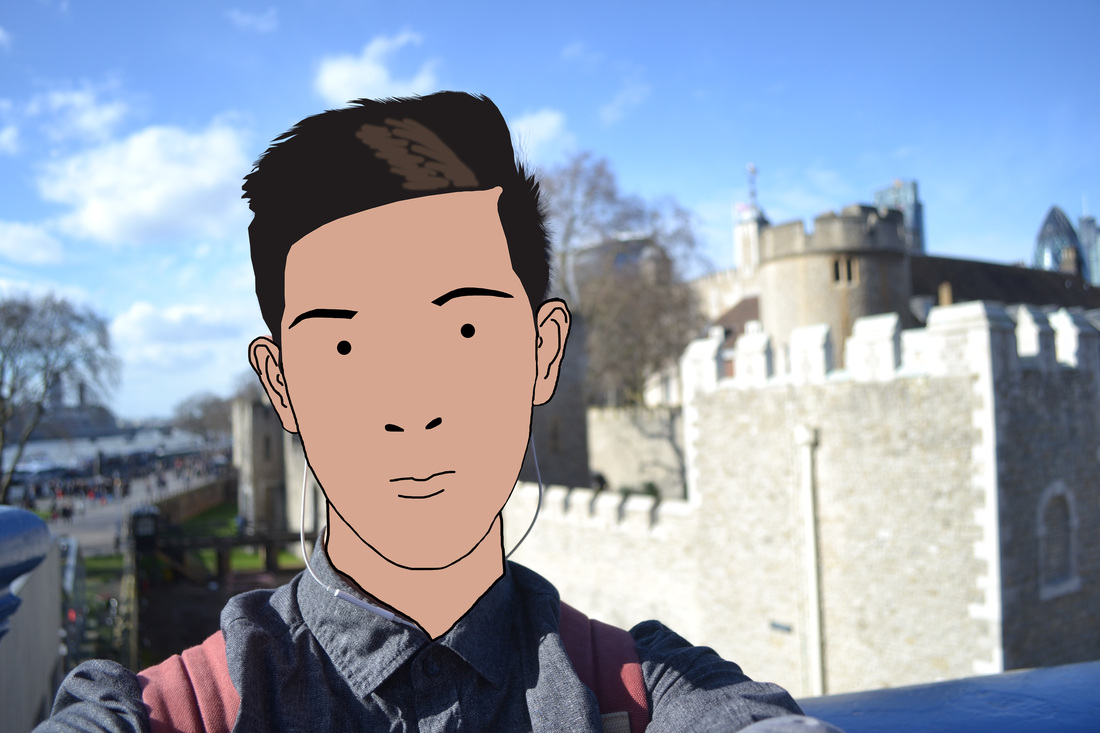
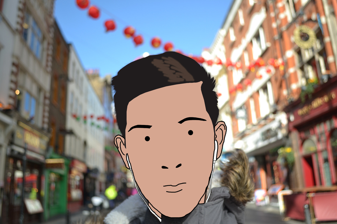
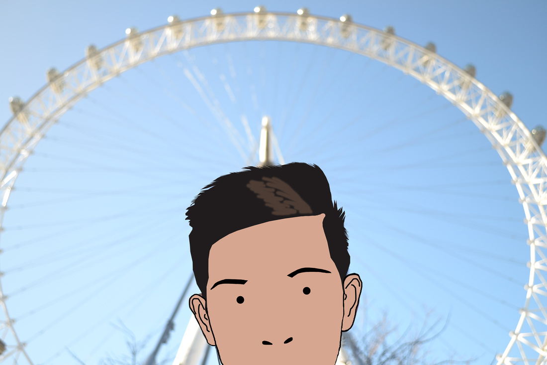
"what are the audience actually interested in within the image?" and how does the relationship change between photo and he audience depending on the contents of the image. I attempted to answer these questions by travelling to some of London's famous landmarks then taking selfies in front of them and later edit them in Photoshop. As most people (viewers and takers) pay more attention to the face rather than the background of the image, when taking the photo I gave the environment behind a soft focus as by doing this it inherits less importance even though it is still a notorious setting. Furthermore, in the editing stage I created the most significant part of the photo by completely cutting out my face. By doing this I feel there is a shift of attention and the onlookers will concentrate more on the backdrop rather than the appearance of the face which perhaps was the original intention of landscape photography.
3rd Strand - Lego
Artist Jan Vormann and an army of volunteers explored the streets of numerous and influential cities looking for cracking and crumbling walls to then repair them with lego. One could appreciate the way the colourful, vibrant blocks contrast with the grey, dull city landscape in these times, however Vormann doesn't only focus on 20th century buildings but also fast-food chains and simple corner shops giving the whole area the same care and attention which funds may not necessarily do to repair. Moving from the big corporate metropolis to the smaller towns of Europe heavily affected by WWII bombings could imply connotations of uplifting spirits, especially as Lego's popularity soared during the 1940's with building kits of concentration camps but now being utilised to repair the more neglected areas in a joyful way in which everyone can interact with and attempt themselves.
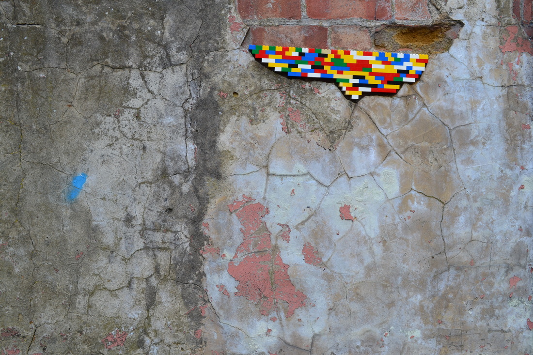
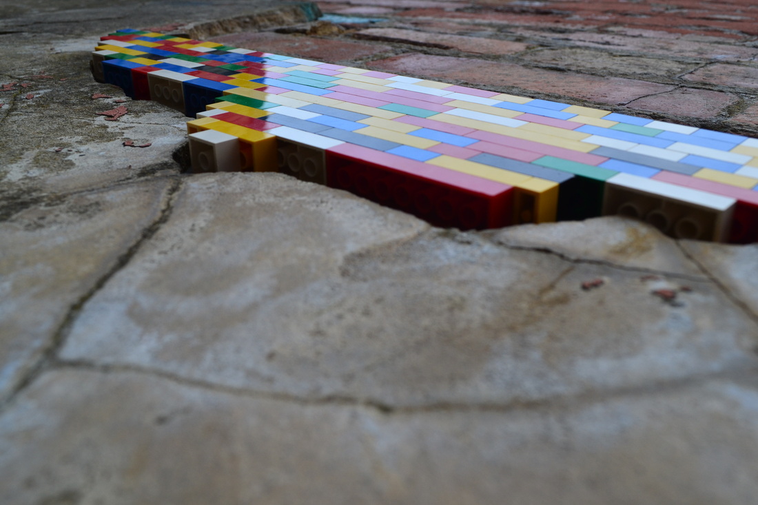
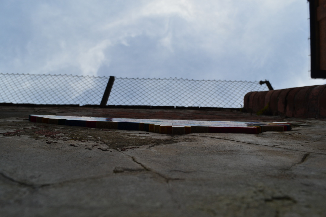
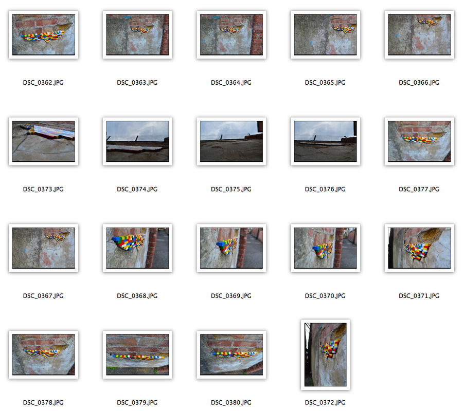
After completing my interpretation of his work, I photographed the outcome using different techniques such as rule of thirds, extreme camera angles, depth of field and lighting. I felt this would further enhance Vormann's intention of illuminating relationships between aesthetics and functionality using contrasting saturations/vibrancies and changing the relationship between the object and it's surroundings.
Strand Development
|
|
|
|
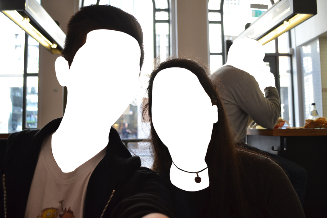
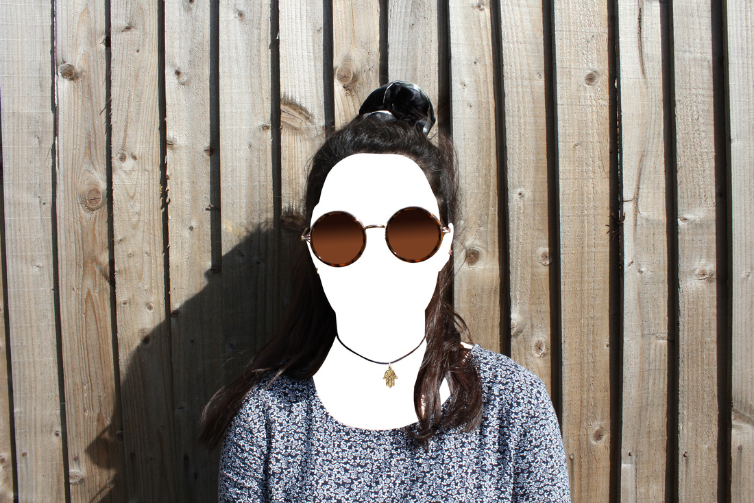
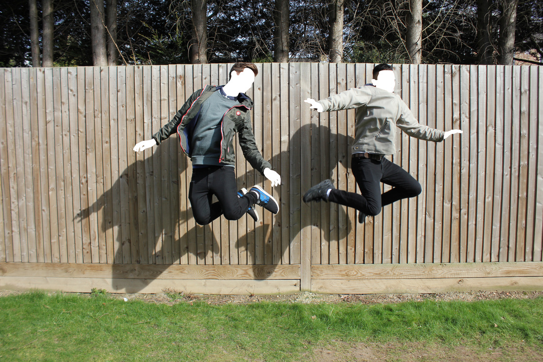
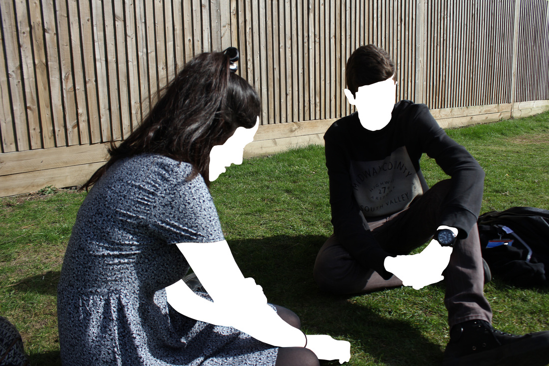
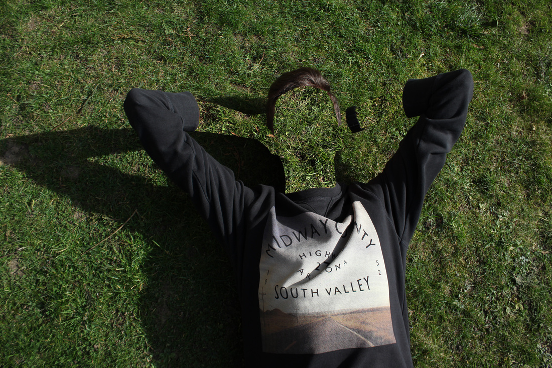
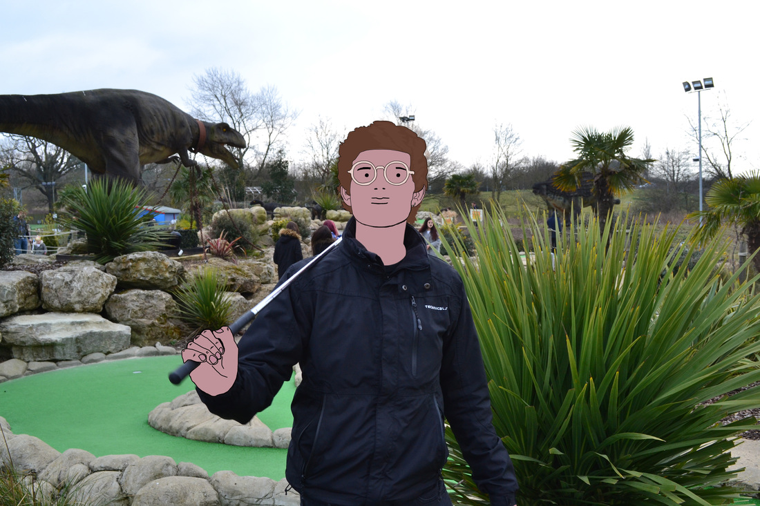
For the second instalment of my 2nd strand selfie, I decided to see how the relationship changes between the camera and the person if there are multiple figures in photo. When editing these photos, I decided to also cut out the faces in the background as opposed to solely the main subjects in the photo but also leaving accessories such as necklaces, sun glasses and earrings because I feel it changes the relationship in the photo as the figures in the surroundings and now given an equal amount of attention rather than being customarily disregarded. Furthermore, the location of the photo has less significance unlike in the first instalment. Therefore the spectators are less distracted by the backdrop and more interested in the small things for instance shiny bits of jewellery. In these sets of photos I subtly focused on making the subjects of the photos pose to see if a spectators could conclude the feelings of them, although I feel this wasn't very successful apart from one or two and as a result will revolve around this theory in the next instalment as this can heavily change the relationship between the person and the spectators when emotion is mixed in when emotion is not 100% clear in the photo because of the blank faces.
Strand Development
|
|
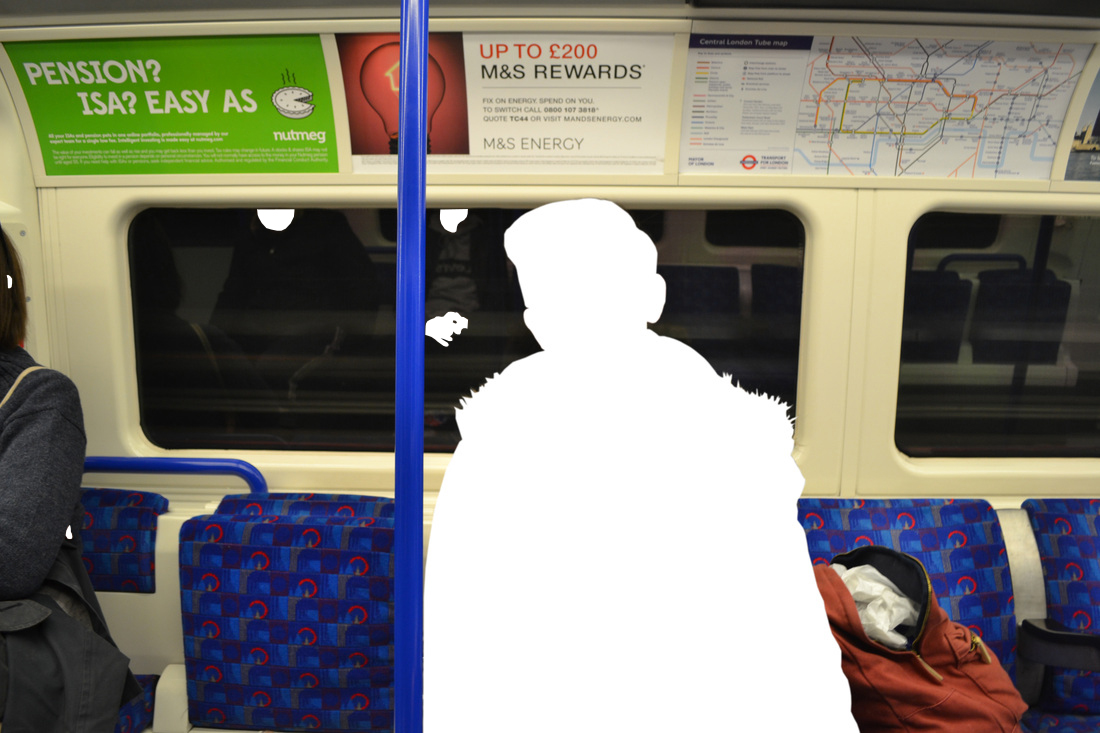
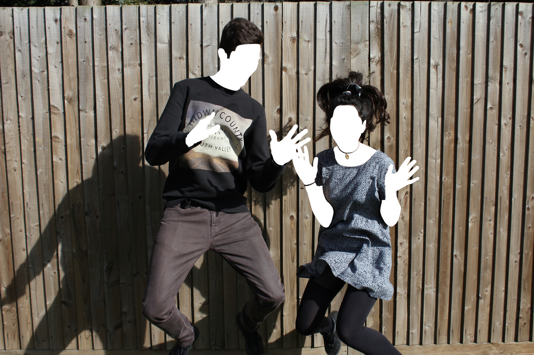
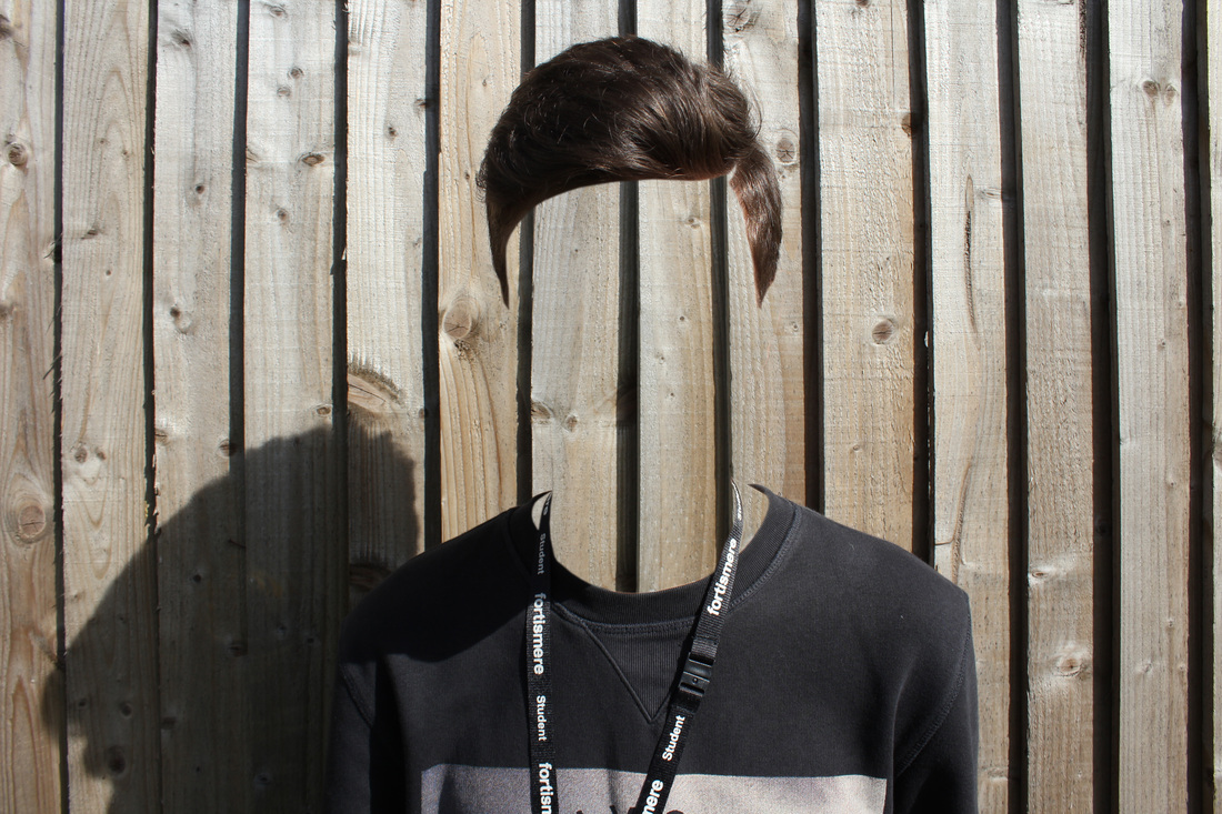
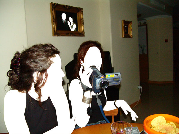
Following on from the last development, I mentioned how the subjects in the photos were posing slightly however it wasn't very obvious post edit. Therefore in this set of photos I got the people to act out emotions showing sadness with the use of body language because slumped shoulders and folded body parts show a closed person. After, I then got them to recreate famous movie scenes where multiple people jump with happiness. Finally, in photoshop I experimented cutting away the face but then replacing it with what would have been there if the person wasn't but still leaving the shadow in. This slightly mirrors the work of Pol Úbeda Hervàs. One could appreciate the way his images gives a sense of mystery because of the full body shadow but still includes a pair of shoes therefore there is a feeling that someone is there but also isn't and it is made possible to fill the shoes with anyone and they would be moulded to their characteristics through their hair, clothing, accessories or posture.
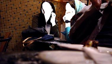
The work from the 3 previous strands mirrors the work of Amir Ali Ghasemi, an artist based in Tehran. The artist's environment strongly dictated his projects 'Coffee Shop Ladies' and 'Party', where a series of woman were photographed from unsanctioned private parties to a local coffee shop however the idea behind the two are nearly identical with the exception that one scene is legal and the other is less accepted by the society they lived in, for example the country's imported magazines contained strong censorship through the medium of lengthened skirts and thick black marker strokes across the flesh of female figures. Although these picture were taken over 10 years ago he did this to show the protect the identity of the women in the photo in a harsh political country but also felt when an audience is viewing it they are left out of the context as the emotion of the scene is removed and only guesses can be made by the posture of the people or the props and background.
The work from the 3 previous strands mirrors the work of Amir Ali Ghasemi, an artist based in Tehran. The artist's environment strongly dictated his projects 'Coffee Shop Ladies' and 'Party', where a series of woman were photographed from unsanctioned private parties to a local coffee shop however the idea behind the two are nearly identical with the exception that one scene is legal and the other is less accepted by the society they lived in, for example the country's imported magazines contained strong censorship through the medium of lengthened skirts and thick black marker strokes across the flesh of female figures. Although these picture were taken over 10 years ago he did this to show the protect the identity of the women in the photo in a harsh political country but also felt when an audience is viewing it they are left out of the context as the emotion of the scene is removed and only guesses can be made by the posture of the people or the props and background.
|
|
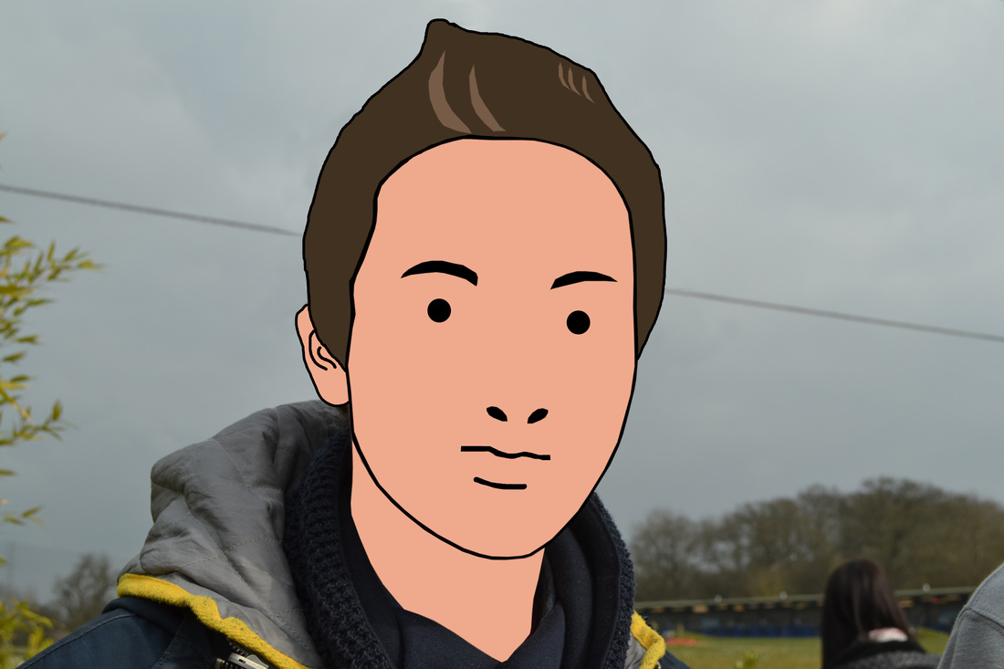
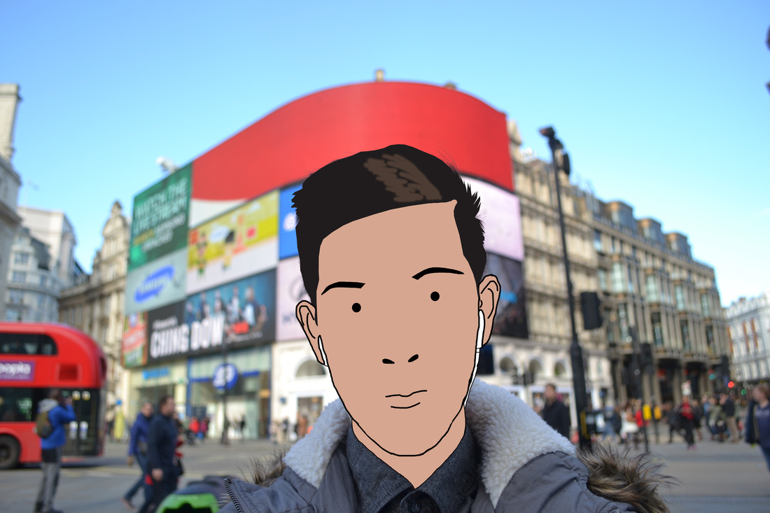
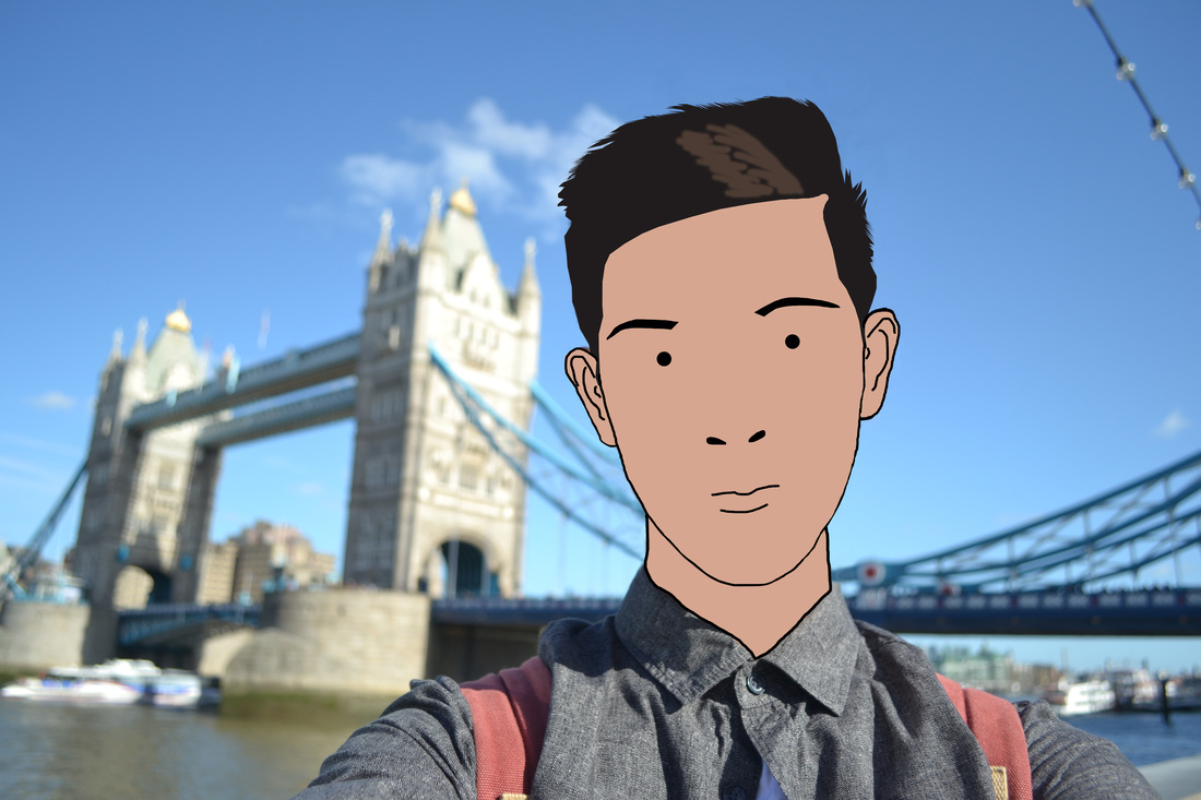
Julian Opie is a British artist who is famous for his elementary portraits styled in a cartoon fashion. He titles each work with their name and occupation which matches the simplicity of the image itself. Opie had the intention to create art digitally in a reductive format and generate a mix between realism and a caricature effect using little more than solid black outlines, flat areas of solid colours combined with shading where light would naturally fall. The British artist consistently removes the person's identity in the photo with a simple circle, by doing this he feels it immortalises them however the audience are still informed of who the person is and the portrait has more characteristics linked to Opie than the original individual.
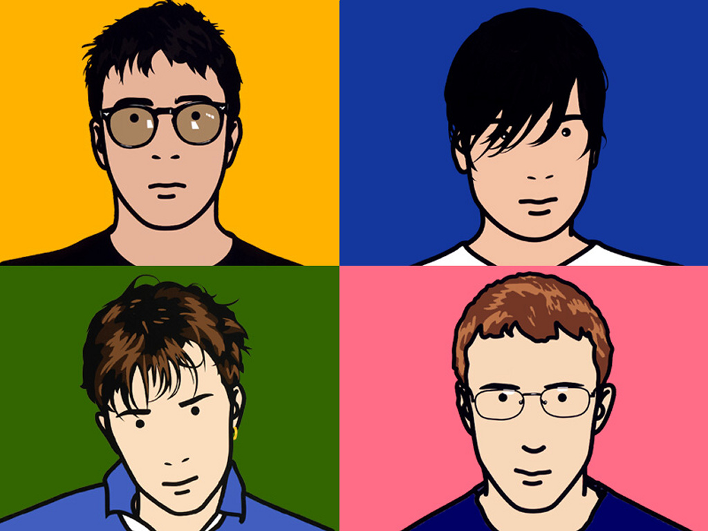
Blur: The Best Of cover
|
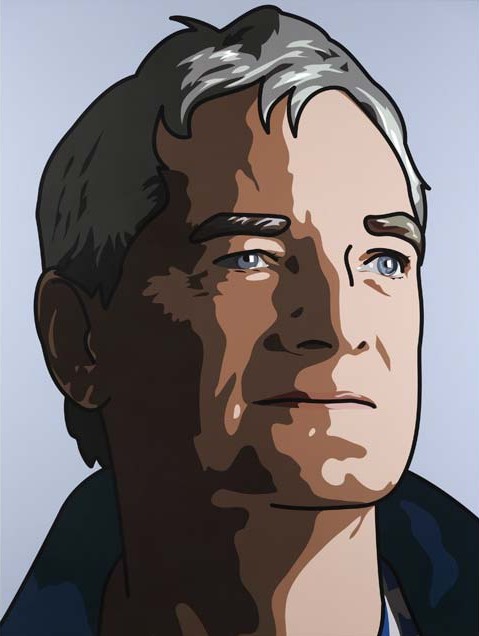
Sir James Dyson
|
Julian Opie is distinguished by the album cover Blur: The Best Of as well as other portraits edited in a similar fashion. The work above uses simple black lines to highlights perhaps the most prominent features of the face however it is challenging to present an array of emotions. He worked on this project throughout the late 1990's to the late 2000's in his studio in Soho using photo editing software and ink jet printers to produce his work displayed in art galleries across the world.
One piece which Opie created in homage to engineer Sir James Dyson was a variation to his other works. This work which can be seen to the top right contains a lot more detail of the face which greater emphasises age and personal qualities over the other more systematic style of art he produces however it still acquires the same format of title (name, occupation). This gives the impression of making him sound like any other ordinary portrait even though it was specifically commissioned by a gallery and has obvious differences to the rest. It is said that the portrait of Dyson successfully matches him with Opie, an artist of international importance who continues to explore new and emerging formats of his work. In the build up to the creation of this portrait Dyson met with Opie in his studio where they would discuss for hours how to create it and what would look best. Numerous outfits, poses, facial expressions and lighting were all experimented with as Julian didn't feel the formally dressed engineer who turned up that day was the man in the final piece. As a result, days and weeks were put in to form the eventual outcome possibly displaying a more casual and content man contrasting to a hard working designer/engineer the nation knows.
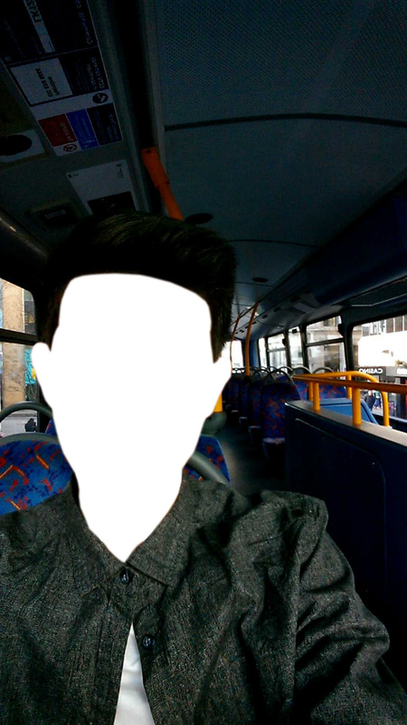
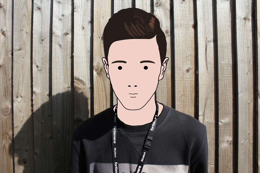
I attempted editing a photo in the same style as Opie using photo editing software simply using a black pen and other tools however this time altering it such as the one in the national gallery. Although one could appreciate the detail input into the delineation I don't feel it represents the original intentions of Opie. Making someone's unique face and features into a flat plain coloured shape with bold outlines. Therefore, for my final piece I decided not to replicate this style but instead revert back to the approach in the 3rd development.
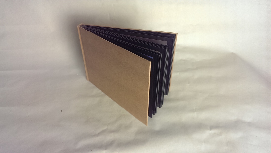
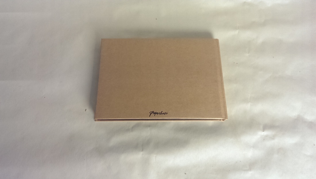
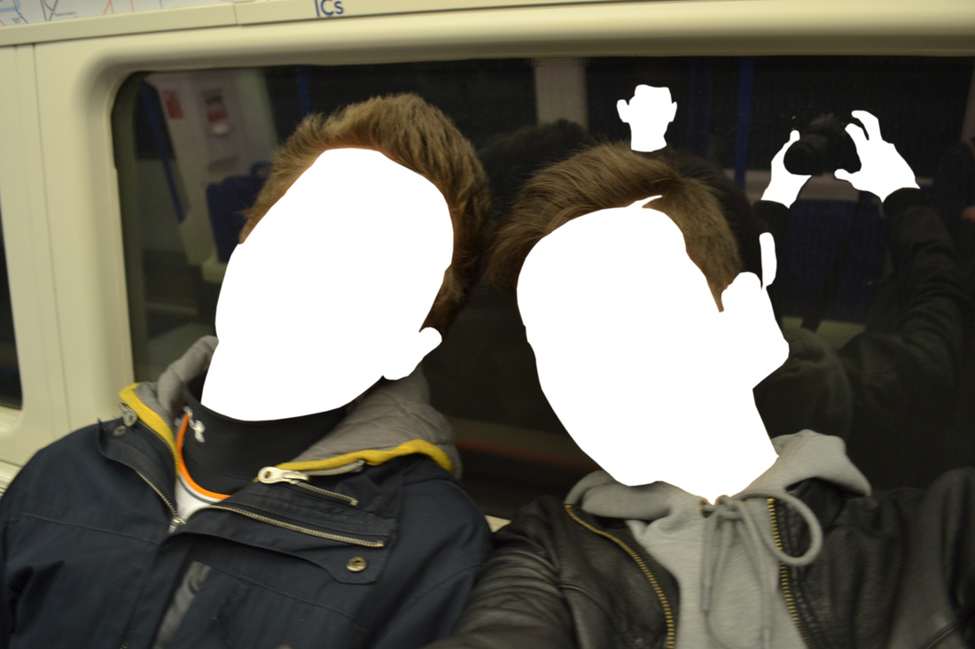
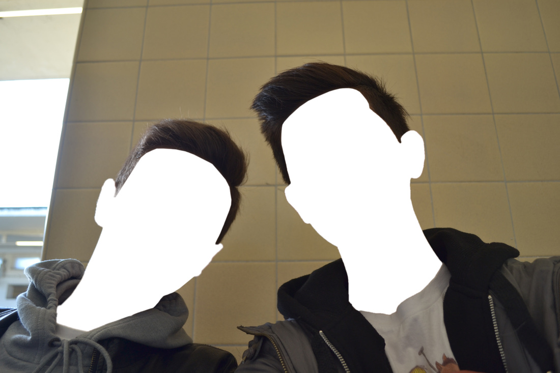
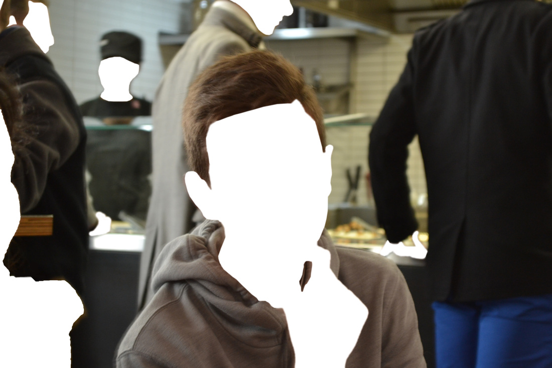
Final Piece
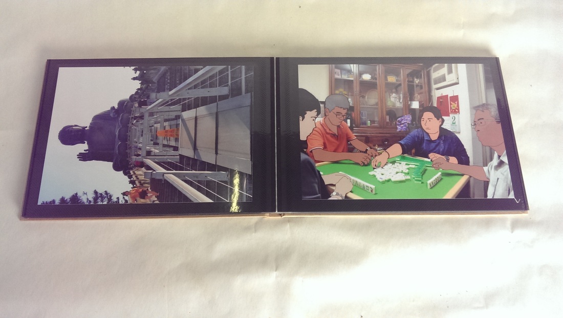
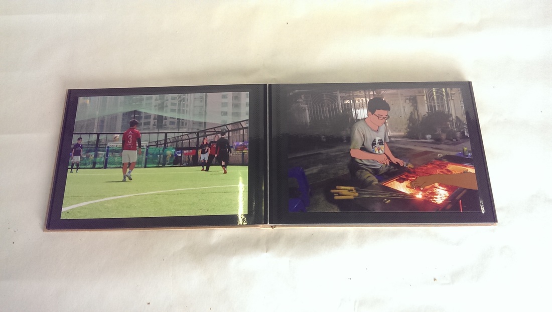
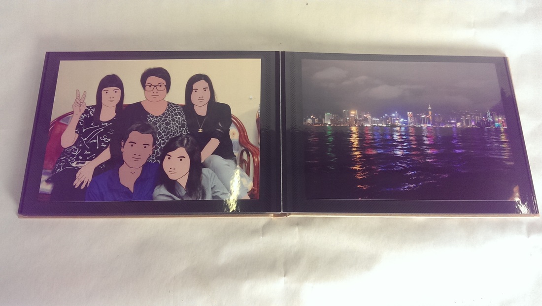
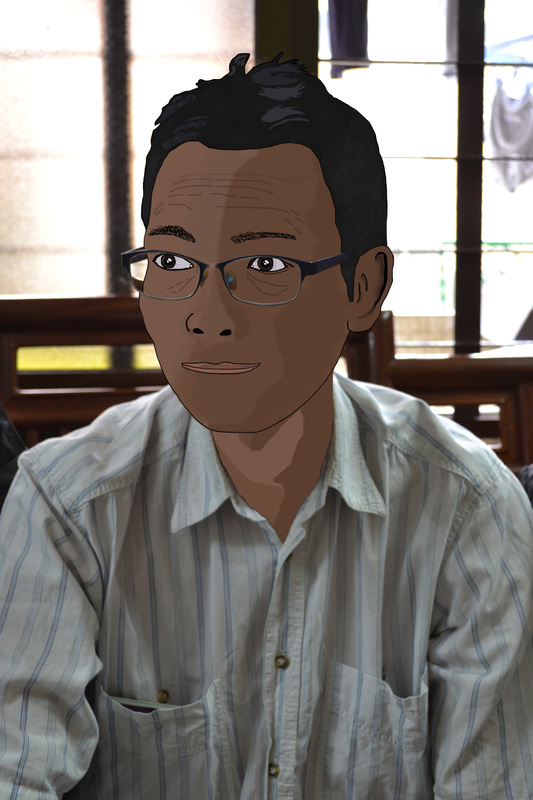
For my final piece I decided to have a series of images printed in a 4x6 format to be present in a traditional photo alum. I chose this approach because I feel it gives the piece a more personal feel as it holds memories and is more likely to be kept for decades rather than a large print e.g A2 where it may be replaced once damaged or outgrown. The images within the book where taken from a trip to Hong Kong which include numerous photos of similar style depicting large family occasions to simple and casual occurrences. However the most significant part of these images are that the ones which contain faces have been edited in the style of Julian Opie's Blur album cover. By doing this it removes the persons identity and yet they are still recognisable to the people who know them. In Opie's work, it shows a single figure with a plain background although when in the location where the photo was taken, I purposefully took pictures with multiple people in the frame however I still edited each individual face which was visible. The makes spectators focus harder on the piece as a whole looking hidden easter egg which in turn gives the backdrop and environment more attention than would normally be received overall possibly making a more intimate relationship between the audience and the images.
For my final piece I decided to have a series of images printed in a 4x6 format to be present in a traditional photo alum. I chose this approach because I feel it gives the piece a more personal feel as it holds memories and is more likely to be kept for decades rather than a large print e.g A2 where it may be replaced once damaged or outgrown. The images within the book where taken from a trip to Hong Kong which include numerous photos of similar style depicting large family occasions to simple and casual occurrences. However the most significant part of these images are that the ones which contain faces have been edited in the style of Julian Opie's Blur album cover. By doing this it removes the persons identity and yet they are still recognisable to the people who know them. In Opie's work, it shows a single figure with a plain background although when in the location where the photo was taken, I purposefully took pictures with multiple people in the frame however I still edited each individual face which was visible. The makes spectators focus harder on the piece as a whole looking hidden easter egg which in turn gives the backdrop and environment more attention than would normally be received overall possibly making a more intimate relationship between the audience and the images.