Character Recognition


A portrait is a drawing, painting, photograph or even a likeness of a person in which the face or from the shoulder up is the main focus of the picture. Myra Greene (work shown above) is a famous artist who captures parts of her face by using traditional methods of photography (glass plates) . This is evident as you can see chemical residue running down the side and corners of the image. Her style of using close ups to express a message returned with a haunting and frightening results. Greene questioned herself, "is my skin tone enough to describe my nature and expectations in life?" and "do my strong teeth make me a strong worker?". Her intention was to make people less bigoted and see the bigger picture as a close up tells a wider story than just their skin colour or a few imperfections. As a result we have been inspired by Myra Greene and attempted to recreate her style of work by photographing family members and friends. Below are a selection of edited pieces of work and the originals in contact sheets.
1st Attempt


Fig. 5
|

|
A portrait can be perceived in many ways, however a full face shot may not give off as many characteristics or qualities of the subject than if it were a close up shot. For example, the top left picture shows most of the model's face whereas the ones the right of it display separate sections of that portrait from different angles and distances. By doing this certain parts of the image are the main focus and the viewer can develop a greater understanding of the image instead of the full picture which gives off more vague messages. For my first attempt I chose two people with a similar age (16 and 18). The young age should suggest these two have an easy lifestyle not needing to worry as much as an adult would for instance, however the close ups can give a contrasting report to expectations. For example if we were to compare fig. 2 and fig. 5, you are able to see that their complexions are distant meaning different ethnicities (also below). Secondly their make up is similar possibly showing the same sense of style or amount of confidence. Furthermore, the distribution of imperfections shows their lifestyles and age can differ as stress tends to produce spots around the forehead area and specific foods can cause them in other places whereas if they were to be more relaxed perhaps they would produce a dissimilar image. Ultimately, close ups are more likely to return with more thoughts than a portrait of a full face, which were Myra Greene's original intentions.
2nd Attempt


Myra Greene's work can be used to the full effect when showing emotion upon faces of people who tell different stories. The opening credits of the TV show 'Orange Is The New Black' documenting life in a women's prison shows multiple close ups of the inmates eyes, noses and mouths in detail. This is an effective way of showing each of their backgrounds especially when it comes to a show such as this. Scars, bruises and lipstick all display the kind of lifestyle within the walls and the limited luxuries they have.

Checking Out Me History
John Agard was born 21st June 1949 in British Guiana and comes from an Afro-Guyanese background. After growing up in Georgetown, British Guiana he learnt about the typical historical events such as Dick Whittington, Florence Nightingale and Lord Nelson however this didn't satisfy interests as much as the history of his cultural background. As a result Agard took it into his own hands to discover more about events closer to home. Afro-Guyanese were forcibly brought into slavery and made to work on sugar plantations but after the abolishment of the salve trade they were still treated very harshly and it was the bravery of few who stood up to the expectations which inspired John Agard to write the poem above including figures like Toussaint L'Ouverture, Nanny De Maroon and Mary Seacole. In respect to Agard we made a mind map of things associated with ourselves. Stuff such as school, hobbies, personally and friends formed us into the way we are today.
George Town
|
Lewis Khan is another photographer who we studied in the portraiture unit. 'George Town' was one of Khan's projects where he felt like most of us neighbours are just a familiar face in the street and often greet each other with a simple nod or have an occasional chat. However Khan wanted to understand more of his "friends" life more and as a result he filmed Pat Benneet telling his story and witnessed what his daily life was like. Ultimately his life was riddled in drugs and alcohol almost on the verge of insanity from loneliness due to a harsh childhood and upbringing. Our task was to take pictures in response to Lewis Khan of people's working environment. I decided to capture pictures of different teachers from the same department then teachers from a different style environment and compare them with each other. Below you will see 2 maths teachers, an ICT/computing room and a DT working environment.
|


|
Above shows my two maths teachers and their classrooms, one female and the other male. After studying them further I was quite surprised by how different two people teaching in the same department could be. For example in the first slideshow the teacher's personal desk is very organised, all stationary is either on one side or in a container however in the second slideshow you can see a lot of papers scattered across the desk and the walls are filled with posters and motivational messages. This shows how their teaching style differs and what kind of a person they are like. For example, from the first classroom you may be able to conclude that the teacher is more interactive with the pupils as one picture displays recently sharpened colour pencils. Also the atmosphere of the room appears to be happier with the bright lighting and spaciousness around the room. On the other hand however, the second teacher can be perceived as a hard worker due to the expression of concentration on his face and the amount of paper on his desk. Furthermore the majority of his students seem to be in the lower years from the simple help posters and untidiness of the room. Ultimately it shows how a community of the same kind of people can be very diverse.
As you would expect computing and design technology are very different subjects with contrasting styles of teaching. Therefore their classrooms will be different too because one subject mainly uses computers whereas the other is more physical and hands on with hard equipment. You can see this by the flooring. Tile carpets are usually installed for most classrooms by reasoning of cheapness and are relatively easy to clean. But in the DT room, there is a hardwood floor. This is because carpets are more of a hazard in these environments, also it is better a wearing than carpet. Us humans are surrounded by different environments and objects throughout their daily life, which can shape them into who they are either by fashion, personality or even how we look physically. (click below to view contact sheets)


Day in the life of...
Our homework task in response to Georgetown, Pat Benneet, was to try and capture the daily life of someone who had a particular relevance to us and see how the items around them make them unique. By analysing this video, it shows their daily routine is simple: wake up, eat breakfast, get dressed, walk the dog then school. But if you look further into certain aspects of the video things like the milk, the coaster mats and his relationship with his dog could make him the tidy and friendly person he is today. This person was relevant to me because we have a lot in common and generally act in the same way however our activities in home life compared to social life are quite different. This could be because of our ethnicity therefore our parents brought us up differently to make us act in separate ways.
If I were to revisit this topic by filming a 'Day in the life of' video, I would improve or change some aspects of the video. For example, there are many parts of the video which are out of focus. This is because the live view on the camera is not a very good representation of what is actually being filmed and as a result it gave the video a soft focus effect. In addition, I used a video stabilisation setting in the editing stage to make it smoother however it still appears jerky in some scenes and inconsistent. Therefore in the future I would try to keep the camera more steady whilst filming as well as including more parts of the subject's day which make them unique such as items close to them.
If I were to revisit this topic by filming a 'Day in the life of' video, I would improve or change some aspects of the video. For example, there are many parts of the video which are out of focus. This is because the live view on the camera is not a very good representation of what is actually being filmed and as a result it gave the video a soft focus effect. In addition, I used a video stabilisation setting in the editing stage to make it smoother however it still appears jerky in some scenes and inconsistent. Therefore in the future I would try to keep the camera more steady whilst filming as well as including more parts of the subject's day which make them unique such as items close to them.
Ulric Collette Genetic Portrait
|
Ulric Collette is a self taught photographer born in 1979 Quebec, Canada who is most famous for his genetic portrait works published in 2012. Collette created his first genetic portrait of him and his 7 year old son whilst working on a completely different project. The portrait arised by accident during the editing stage when he realised comparing one half of a face to another is an effective way to show the resemblances between relatives. As a result, in 2008 he began to shoot portraits of other family members of different age and gender in controlled environments. Subsequently the project was born.
|
A selection of Ulric Collette's portraits showing similarities and differences of age and gender.
|
Family faces are magic mirrors looking at people who belong to us, we are able to see the past, present and future within them. Our task was to picture friends and family and then splice them together in a photo editing application. Below you can see the multiple attempts using different family members and friends.


My first attempt on the left didn't work as planned. For some reason the auto blending tool didn't stitch together the two portraits together properly and as a result one face appears more than the other, however from the photo, the spectator is still able to see that the nose and lips are very similar due to genetics. On the other hand the skin tone and complexion are considerably different as the environment these two people were brought up in are from different regions (the same being for the 2nd image). My 2nd attempt returned with a better result showing the difference of age by showing the shape of the face, this is because the environment these two work around daily are contrasting as one spends the majority a day in an office sitting down at a computer which means their life is not as physically demanding whereas the other's is very active during school hours and when going out socially. Nevertheless, the viewer is still able to identify the similarities between the two for example the eyebrows, nose and mouth expressing the message of how a merged image can represent the past present and future. Finally the last image shows myself and my sister merged into one. Although we resemble each other on the grounds of age and genetics, we are influenced by different people most likely because of our gender. For example my sister may follow her fashion choices and make up decisions from peers or other icons whereas I choose to follow a different route of leaving things natural. Ultimately, the same sort of face expression mirroring each other display a good sense of friendship and assurance between one another.
Cyanotypes
|
An image can give off various implications depending on the material in has been produced on. A cyanotype is a photographic printing method which utilises a cyan-blue print. This process was widely used in the 20th century by engineers to reproduce plans known as "blue prints" however more recently, a photographer currently working alongside Fortismere school has used it to recreate childhood memories sometimes with the addition of her imagination using her 12 year old son and his class mates from school. Sayako feels she remembers very little from her childhood and as a result has attempted to bring back the feelings held at that age by capturing images of her son, the model poses with a slouched back and a bored expression across his face, he is also not looking directly into the camera which may put the audience into his shoes. As a child you hardly ever want to sit down and do what your told, constantly wanting to run riot and enjoy living a stress free life. Therefore Sayako has made multiple edits of these photos, one style implemented the use of a black ring highlighting a specific part of the photo surrounded by a predominantly dark background, the quality of the image also leaves behind a slightly grainy finish. I feel the combination of these ideas leaves an effect of ageing on the photo and the model, an inevitable part of life along with the contradicting reflection of time freezing within the photo. This is done by focusing on separate parts of the model's face.
|

Click to view Sayako Sugawara's page

Click to view Sayako Sugawara's page
|
We revisited the darkroom with negative self portrait acetates in hand to experiment different ways of developing photograms. Our first task was to see how a thin layered material would affect the exposure of light onto the photographic paper and the final outcome of the piece. Because muslin cloth is very thin and easily shows the stitching, it was a interesting material to use as it gave the photograms a more materialistic view to it rather than a simple paper texture. However I preferred the use of tissue paper because that it was more flexible to work with and could create more intricate photograms by folding, reshaping and placing the material in various places highlighting a certain parts, which for example is shown below where the tissue paper covered the whole negative portrait. On top of that I tore into the material hoping those parts would be more exposed to light and unveil more of the portrait such as the eyes but unfortunately I was not able to rip the paper in the correct areas, also the exposure time meant the photo was too light to make some features more distinguishable than the others.

Negative Acetate
|

Layout beneath enlarger (darkroom)
|

Photogram
|
|
Whilst using this method of layering materials, we had to use a glass plate to sandwich all layers and keep everything in place. I then came up with the idea of sprinkling water on the glass to see what effect it would have in the photogram as water diffracts light waves. It came back with some beautiful results, therefore I combined both the use of tissue paper trying to highlight certain parts once again to create the piece in the bottom left. Ironically, the water gives of the effect as if the paper was an ember in a fire, furthermore, the tissue paper enhances the stern look upon the face which when attached with the fire effect gives the overall picture a demonic feeling towards it.
|
Finally, another technique we learnt was to brush the developer chemical onto the photographic paper, by doing viewers are able to see the brush stroke but also only some parts of the photogram are developed. I felt this gave the illusion of an imperfect image and makes the spectator question the picture more. For example, the picture in the bottom right was developed with a paint brush and used the tissue paper and water method described previously leaving behind an incomplete image with a rain on window effect. However when delving deeper, the unfinished"ness" of the image makes it appear as a distant memory unable to remember adequately, in addition the tissue paper creates a lighter, more translucent portrait supporting the idea of an incomplete memory along with the water sitting on top of the picture as if the subject were locked out of reality.
|

Water and Tissue Paper
|

Brushed on developer
|
The Photographic Object
Art is considered an expression or application of human creative skill and imagination, typically in a visual form such as a painting or sculpture, producing works to be admired primarily for their beauty or emotional power. Therefore it may be argued that photography is an art form, however some complain it is too simple to compete with works of "art", as a result some photographers have incorporated techniques associated with art which rebrand their pieces and allow them to contend against other such sculptures and paintings.
Our task in class was too manipulate portraits in the style of creative figures such as Gerhard Richter, Lucas Simoes and Joseph Para. I chose to recreate a portrait in the inspiration of Gerhard Richter. His work consists of film processed photographs layered with paint, drawing away attention from the actual contents of the image and instead forcing our mind to bring consideration to the tactility of the piece. By doing this and blocking out parts of a photograph, spectators may think what would have been the most important part of the picture is actually irrelevant, and unnecessary things in the future are easier to block out and ignore than previously thought giving the audience a wider mind set. The 3D effect created by the layers of paint smeared across the canvas may also give a sense of power and redundancy as the idea of size and stature is more accepted in the modern world, meaning objects in a flat image are more likely to bear equal influence unless a sense of depth of field is given, therefore a photograph with areas which extrude the foundations provide a better impression of significance over the rest of the picture. Consequently, my response displays a portrait containing multiple layers and numerous colour combinations covering what I feel are the less important parts of the face hoping to leave the message of being grateful for what you have as some people aren't as fortunate to even possess the bare necessities of life.
Our task in class was too manipulate portraits in the style of creative figures such as Gerhard Richter, Lucas Simoes and Joseph Para. I chose to recreate a portrait in the inspiration of Gerhard Richter. His work consists of film processed photographs layered with paint, drawing away attention from the actual contents of the image and instead forcing our mind to bring consideration to the tactility of the piece. By doing this and blocking out parts of a photograph, spectators may think what would have been the most important part of the picture is actually irrelevant, and unnecessary things in the future are easier to block out and ignore than previously thought giving the audience a wider mind set. The 3D effect created by the layers of paint smeared across the canvas may also give a sense of power and redundancy as the idea of size and stature is more accepted in the modern world, meaning objects in a flat image are more likely to bear equal influence unless a sense of depth of field is given, therefore a photograph with areas which extrude the foundations provide a better impression of significance over the rest of the picture. Consequently, my response displays a portrait containing multiple layers and numerous colour combinations covering what I feel are the less important parts of the face hoping to leave the message of being grateful for what you have as some people aren't as fortunate to even possess the bare necessities of life.
|
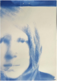
For homework we were asked to conduct further research of artists linked with manipulating photographs into art forms. I chose to endeavour deeper into the artists May Xiong and Dryden Goodwin, I soon discovered that these two share the same sort of ideology as both attempt to gain a greater understanding of the mind and it's structure. May Xiong's project geometric maps links the idea that every mind has a structure to it but we don't yet quite understand why and how we think about things. This is shown by straight lines creating geometric shapes across the portrait however most of the lines encompassing the shoulders and above, in addition each portrait contains a different geometric map implying everyone has a different way of thinking to others and a sense of individuality. (click on images below)
|

|


Dryden Goodwin, as mentioned previously had similar implications to May Xiong's project. They're similar in the way both artists focus around the mind's people but different in the fact that Xiong used models in a controlled environment however Goodwin photographed strangers with the idea that we don't know what they're thinking because we don't know them. This is represented by white lines scratched into the shape of the head which shows the structure of the skull and the brain within the portrait. As a result my intention was to combine both styles of the two artists to create a portrait representing the separate parts of the brain by sewing onto the image giving it a 3D effect increasing the tacitly and contextual meaning of the photograph.
Using our portraits taken for homework, we then manipulated them in the styles of our researched artists. As you can see I have sewn into the image combining the techniques of May Xiong and Maurizio Anzeri. Although it may seem simple physically, the contextual meaning behind it goes further. People are often surrounded by their thoughts and in a pensive state, especially at the stage which the model is at in the portrait. Therefore, the shapes conforming around her head represent unclear thoughts and confusion shown by the non systematic layout of the geometric map. I chose this message because I feel in this generation, students are constantly instructed to improve or face consequences, however it is not possible for all pupils in the same year group
to have an equivalent working ability and yet their future's are still determined by several hours of examinations crammed into the space of a month. It is for this reason most teenagers are confused about what path to take without being judged by society's "standards" and to procrastinate hours on end.
My second attempt at manipulating a portrait came from the inspiration of Lucas Simoes. Although he is not the only artist to utilise the effect of layers, I feel this piece of work is most similar to his in the fashion the contextual meaning behind my portrait speak about a person's personality and as much as you think you understand someone there will always be undiscovered layers because of the anxious lifestyle most teenagers live in, constantly under some sort of threat. If I were to carry on this message in a final strand, I would still use portraits of someone but instead over a visible amount of time to represent ageing or changes we take on. Or perhaps a mixture of people to show the diverse society we are surrounded by everyday. Furthermore still using the grid format as it shows contrasting emotions and possible characteristics one could think about the subject.
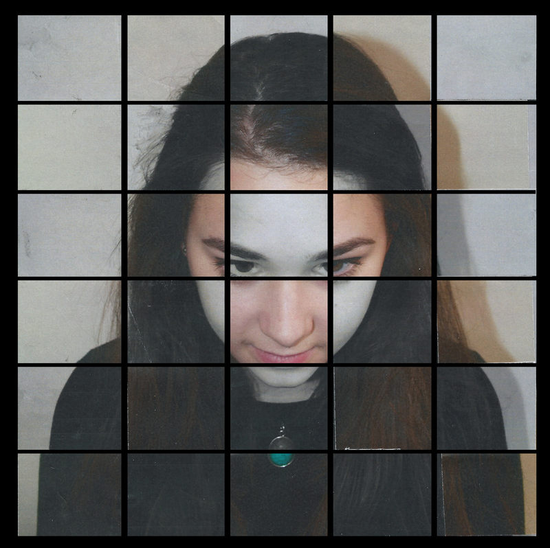
As mentioned earlier this piece was inspired by the artist Lucas Simões. Born in Brazil with a educational background in design and architecture which some say heavily influence his works today. His common pieces often use a variety of materials such as photographs, maps and books which he then proceeds to manipulate it by folding, cutting, burning, diluting or distorting the photo all together. His intentions are to erase bad or meaningless memories from his mind as the pictures used are from childhood containing people who are no longer in contact with Simões. However, if it is not his own picture being manipulated, the pieces in question are created over a short conversation with a stranger where he "listens" to a personal story whilst listening to music through headphones. Then his intention is to intervene in the original message of the object or image and create a new representation that oscillates between staginess and beauty, movement and depth. He enjoys to make something strange but to turn it into something beautiful is even better. Although, I haven't gone to the extreme in which Lucas Simões has, I have still created this piece on paper as opposed to doing it digitally. This is because I prefer the way some parts stick out and its not perfect which similarly match the methods and ethos of the inspirational artist.
If I were to continue and develop on this, apart from using time as a variable and maybe more people, turning the piece into a GIF where the squares would alternate between colour, white and black, and different sections of people;s faces would make this piece more alive and interactive although it does lose the physicality of it.
If I were to continue and develop on this, apart from using time as a variable and maybe more people, turning the piece into a GIF where the squares would alternate between colour, white and black, and different sections of people;s faces would make this piece more alive and interactive although it does lose the physicality of it.
